
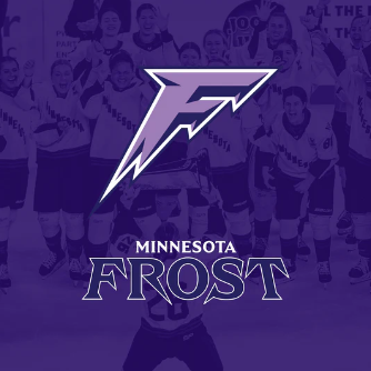
Analyzing the Development of the PWHL Team Identities: Minnesota Frost
The Minnesota Frost’s new name and visual identity successfully represent one of the state’s core truths: it’s really cold.
The Minnesota Frost’s new name and visual identity successfully represent one of the state’s core truths: it’s really cold.
Name
According to the PWHL’s Vice President of Brand and Marketing, Kanan Bhatt-Shah, the PWHL’s design team considered a large number of names for Minnesota:
“[Frost] came up from several different areas. That was a name that kept coming up and [that] we heard was very popular and had a lot of resonance.”
Minnesota is a very snowy place. A number of current and former teams have drawn their names from the state’s nature and climate: the Timberwolves and Lynx, the Wild, the Vixen, the Lakers. In soccer, Minnesota has had the Thunder and the Lightning, and Aurora FC. The ancestral elite women’s hockey team in the region was the Minnesota Whitecaps, named after waves on top of the state’s many lakes. The name Frost fits into that history.
In terms of a hockey name, it has a certain charm considering the sport’s connection with ice and snow. In terms of a team name, ‘Frost’ doesn’t bring to mind any sport or group dynamic. Perhaps it insinuates a creeping danger.
Colors
Last year, Minnesota’s color was a dark purple. An additional lighter purple has been added this year which is a good compliment to the darker shade. In the logo, the lighter purple is the main color, with the first season’s purple used as shading.
Cheering LOUD for our friends the @minnesotalynx as they begin their playoff run this Sunday! 🗣️#PackTheHouse pic.twitter.com/PE4QH727OV
— Minnesota Frost (@PWHL_Minnesota) September 20, 2024
In other graphics, the team is using a gradient of blues and purples as well as white/silver/gray to represent frost. There’s a lot of potential in this range of colors and design elements beyond what we have seen so far.
In line with the PWHL's propensity thus far for choosing colors similar to other non-hockey teams in the locality, two notable teams near the Frost's Twin Cities home have purple as a primary color. The NFL's Minnesota Vikings and the NCAA's Minnesota State—which has a strong women’s hockey program—both use purple. This places the Frost adjacent to, but not overlapping with, other teams their fans may already cheer for.
Logo
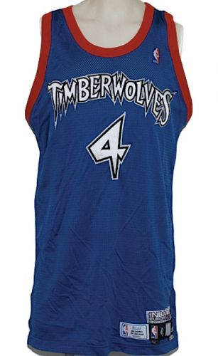
The Frost logo is in the shape of an F. Its spikiness is meant to represent icicles. For me, the F is too thick and the triangles coming off it are too stubby to really say ‘icicles,’ but maybe that’s how icicles are shaped in Minnesota. It does, at least, give a vibrant sense of danger: this thing feels like it can move, and it might stab you. The logo design and the typeface of the wordmark are also reminiscent of a font the Timberwolves used 20 years ago.
Bhatt-Shah spoke on what the updated color palette adds to the logo:
“The additional color palette elements, the lilac, the blizzarding white, those other colors that round it out, it's really meant to give depth and dimension to the logo, icicles, and really this monochromatic look that adds to the intensity and fierceness of Frost.’
I would say the colors succeed at that job. The logo is extremely untextured, apparently intentionally so, to reference the smoothness of ice. The darker and lighter purple does evoke ice in the way thicker ice will mute darker colors. There could be a reference to pond hockey swirling around in there somewhere.
Summary
In choosing this identity for Minnesota, the PWHL design team, per Bhatt-Shah, were very intentional about “[building] an identity around [Frost] and the storytelling that makes sense for Minnesota and connects in an emotional way and speaks to the people.”
I don’t think the Minnesota Frost’s whole story has been told yet. There are a lot of things besides just the name and logo and palette that give a team visual identity. The jersey design could play an immense part in this. Last year, the dark purple was Minnesota’s only color. Moving forward, they have more options, and the art they choose will help us understand the story ‘Frost’ is supposed to tell. This could involve gradients, sharp diagonal cuts, or the inclusion of additional colors like white and silver. There could be visual references to other teams of the past, or other aspects of Minnesota’s history.
At the moment, the Frost doesn’t have my favorite brand identity, but it has potential.
Comments ()