
PWHL Jerseys, Worst to First
Breaking down the good, the bad, and the boring of the PWHL Year One uniforms.
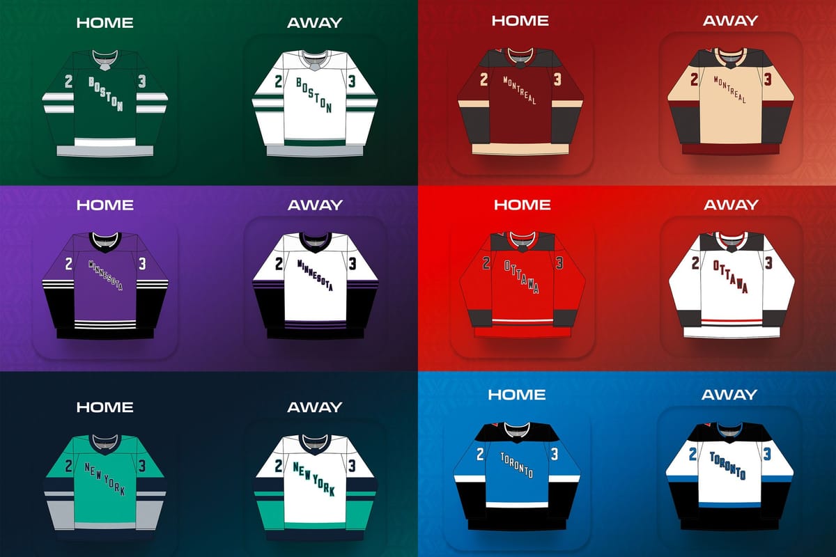
As a lover of hockey design, one of my major disappointments in the PWHL's first season was the lack of real team names and logos. Every new team is an opportunity to craft a new aesthetic identity to represent the team, the city, and the community, and some new hockey teams have hit that out of the park. Instead, what we got in the PWHL was teams named after the league and their city, with generic jerseys lacking personality (and stripes that go all the way around the sleeves).
PWHL Ottawa general manager Mike Hirshfeld said in an interview that team names and logos are coming in September, which will hopefully mean new jersey sets to match the new identities. With that in mind, I wanted to reflect on the aesthetics of PWHL Year One and rank the six teams’ jersey sets from worst to first. Much like my last jersey review, my methodology and style are inspired by Hockey by Design, but the opinions are all mine. Let’s get into it.
6. PWHL Ottawa
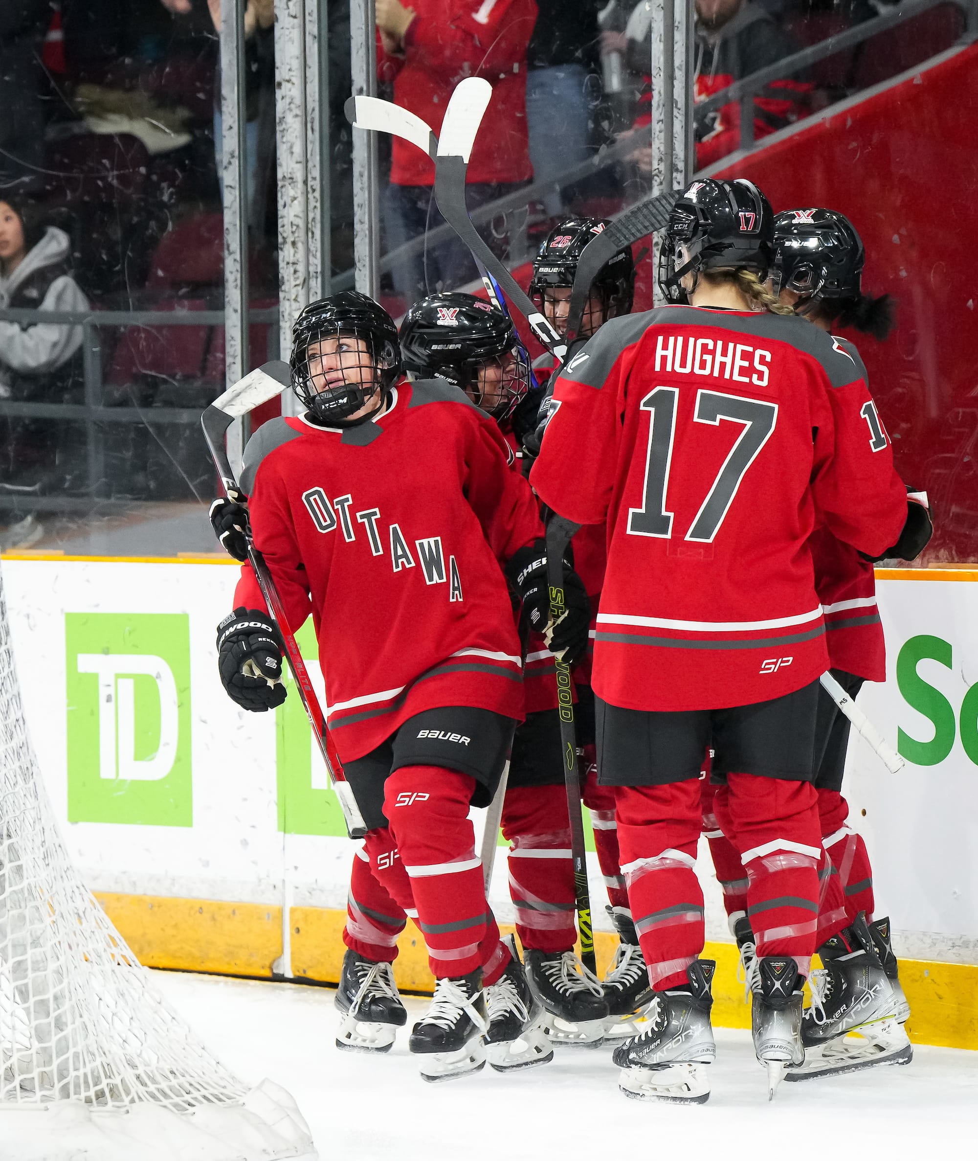
I’m sorry Ottawa, I enjoy your team but your jerseys are the blandest of the bunch. The home and away kits are one-to-one color swaps of each other, and the design elements are nothing special, even compared to the rest of the less-than-exciting field.
The main design elements of the template are a black rounded shoulder yoke, black cuff stripes, and two thin stripes along the waist (one black, the other to contrast the main color). I may have liked these jerseys more if they stuck to the squared-off shoulder yoke shown in the mock-ups. The other two Canadian PWHL teams both have rounded black shoulder yokes in their designs, so it would have helped Ottawa stand out a little more.
The thin stripes at the waist aren’t bad, but I wish that design element was echoed elsewhere. Layer it on top of the black cuffs, or add it under the shoulder yoke like the Metropolitan Riveters’ final blue jersey. I’m not a fan of the thick black stripes at the end of the sleeves, though. It’s an unnecessary element that doesn’t look good on a mock-up or on a fan, and disappears into players’ gloves on the ice.
I do like the bright shade of red that PWHL Ottawa used; it stands out on the ice and is particularly good in a match-up against Toronto or Minnesota. The layout of the “Ottawa” text is also one of the better executed. However, I don’t like the text treatment on the white jerseys, where the red outline is either garish or unnoticeable.
The PWHL Ottawa jersey isn’t technically bad, there’s just absolutely nothing interesting about it.
5. PWHL Toronto
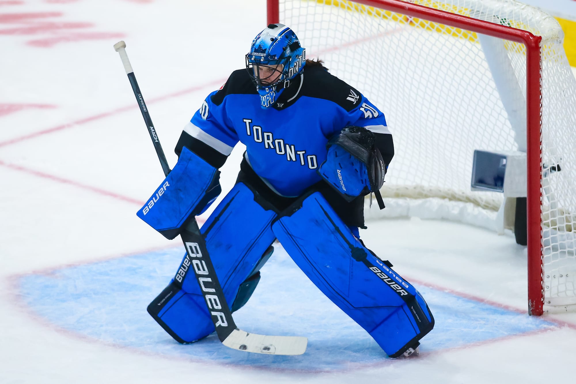
“Not technically bad but completely uninteresting” also applies to Toronto. I give it a slight leg up on Ottawa because it’s a more cohesive design, but it’s not much more striking.
The template has a black, rounded shoulder yoke, black cuffs, and a black hem on both the home and away jerseys. On the blue home set, it has a thick white stripe above the black on the cuffs and hem; for away games, the thick stripe is blue. Once again, it’s a one-to-one blue-for-white color swap, but the consistency of the black elements and their larger presence on the whole design is effective.
I tend to like a full-color cuff sleeve design, so I have no qualms about that, but I would have loved to see another stripe or extra splash of color, like the Seattle Kraken or Toronto Six jerseys. Toronto also had a decent text treatment- I like the blue letters with the black outline on the white jersey. The “Toronto” fits on the torso space fine.
Again, I like enough of the elements, but there is nothing exciting about this jersey. It’s the kind of thing my brother and I would make for a custom team on one of the NHL video games.
4. PWHL Montréal
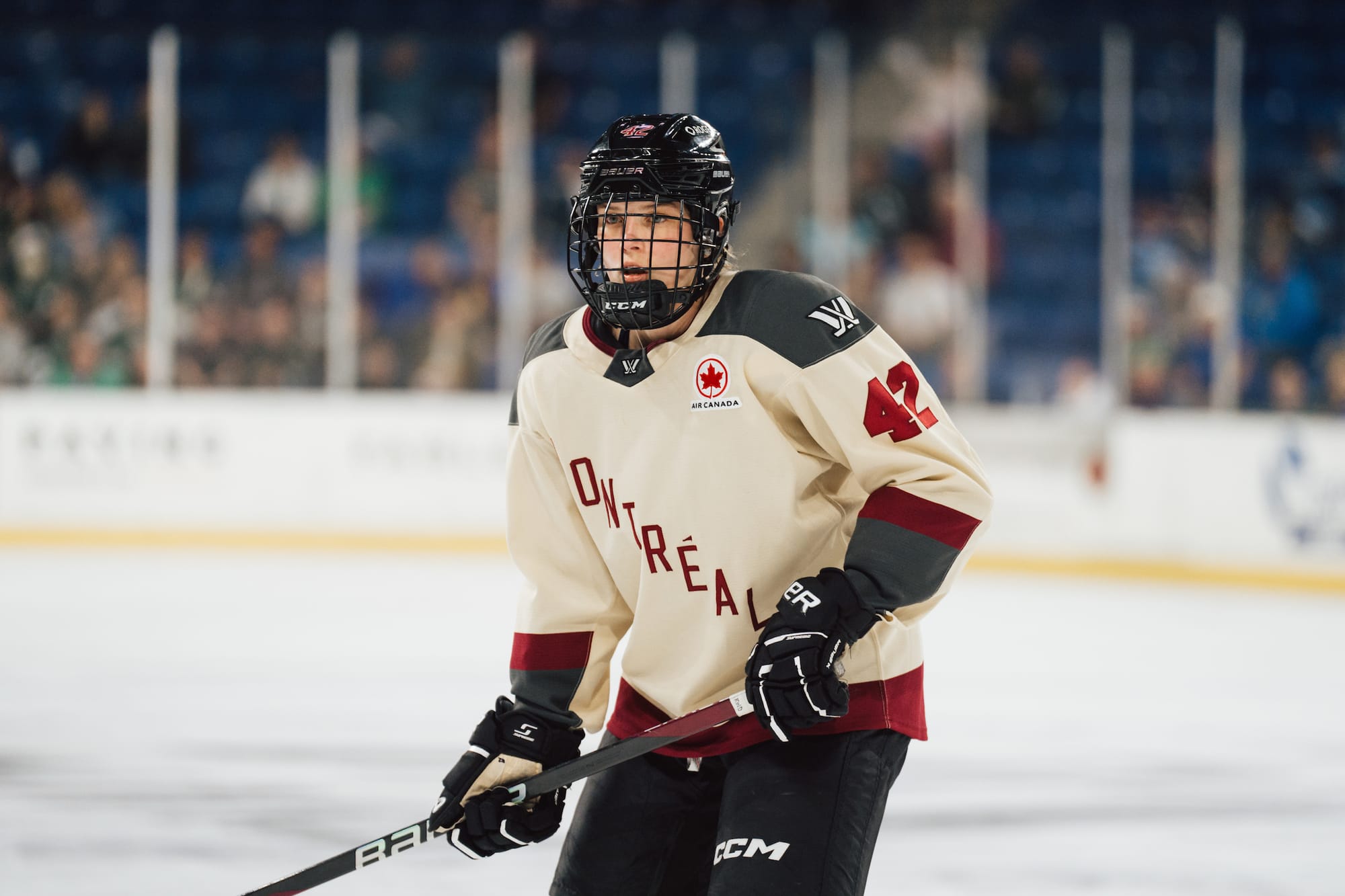
Finally, something interesting to note! It’s not in the design of the jerseys themselves, unfortunately, but in the color. I really like that PWHL Montréal used cream instead of white for their light away jersey and as an accent color. Cream in hockey design is usually used for throwback or retro-style jerseys, which feels appropriate for a city with so much hockey history. It also plays really nicely with the maroon Montréal uses as a primary color- both hues have this richness to them that I enjoy. I also appreciate that the wordmark got the accent in Montréal.
That’s about it on the things I like, though. The template is practically the same as Toronto’s, and equally uninteresting. The only other difference besides the color scheme is that there’s only one thick stripe at the hem and it’s in a contrasting color to the jersey base rather than black. The designers who did the PWHL jerseys must be American, because they left the more interesting striping patterns for the teams from the US.
3. PWHL Boston
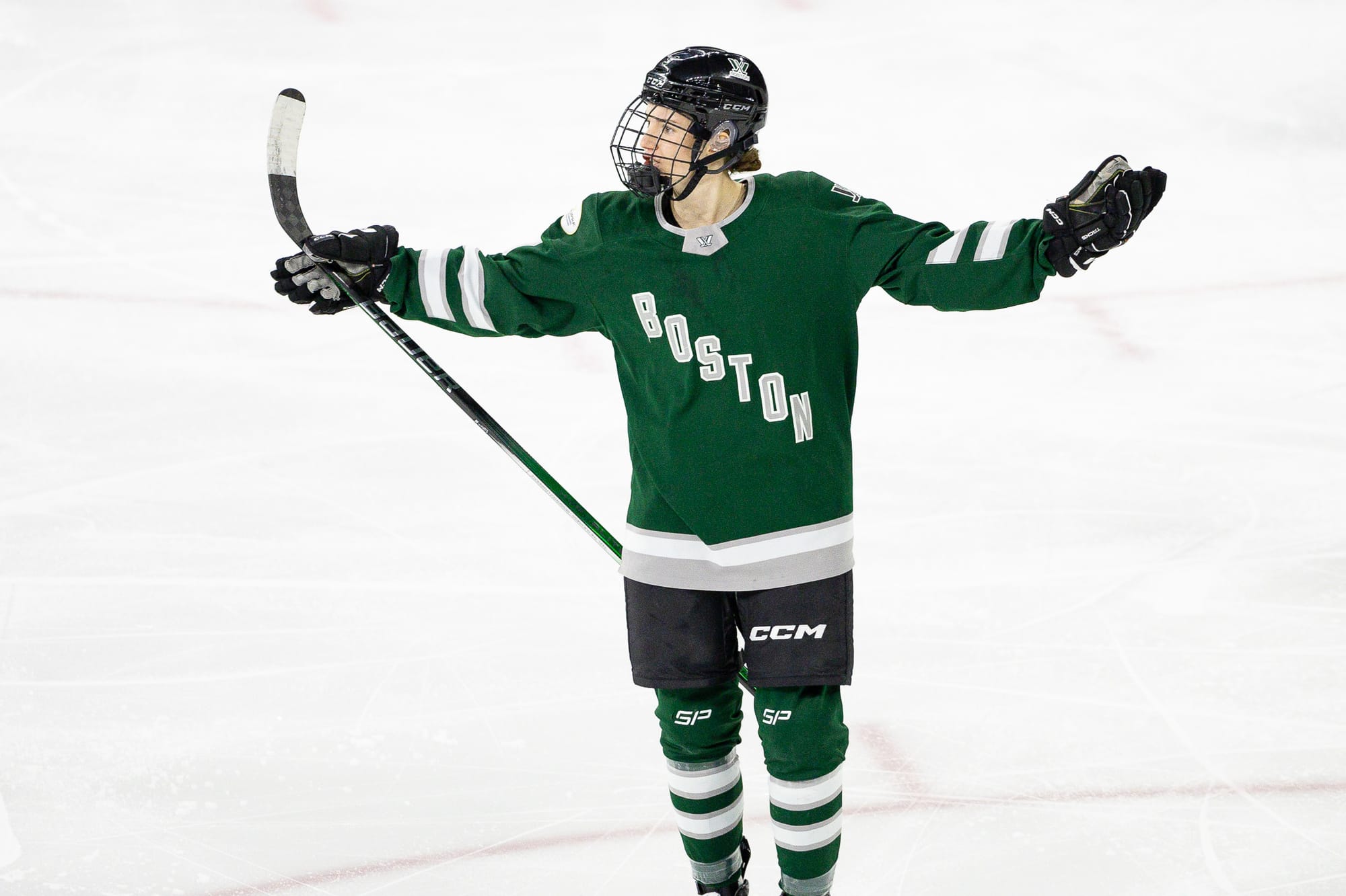
I’ll give credit where credit is due, I really like the Boston team in green. I think the deep, forest-y shade looks really good on the home jerseys, and it brings in a little city synergy with the NBA’s Boston Celtics. For better or worse, putting PWHL Boston in green and silver also helped distance them from the beloved yellow and black Boston Pride.
The striping pattern is very classic. Two stripes around the elbows, white on the green jerseys and green on the white jerseys, with two thin silver stripes on either side. However, the silver is so hard to see against the white stripes or white base that they almost don’t exist. This made me realize that the Boston jerseys are basically green Toronto Maple Leafs jerseys with an added silver stripe at the hem- not necessarily the greatest pairing for two cities with a lot of hockey beef between them.
I wish there was more successful accent color use to liven up these jerseys, because the green is totally going to waste. I don’t think silver is the way to do it, so maybe bring in black, which is used for the players’ equipment. I think a thin-thick-thin stripe on the elbows would look good, maybe even borrow it straight from the Bruins. But I am bummed about the wasted potential of the PWHL Boston jerseys.
2. PWHL Minnesota
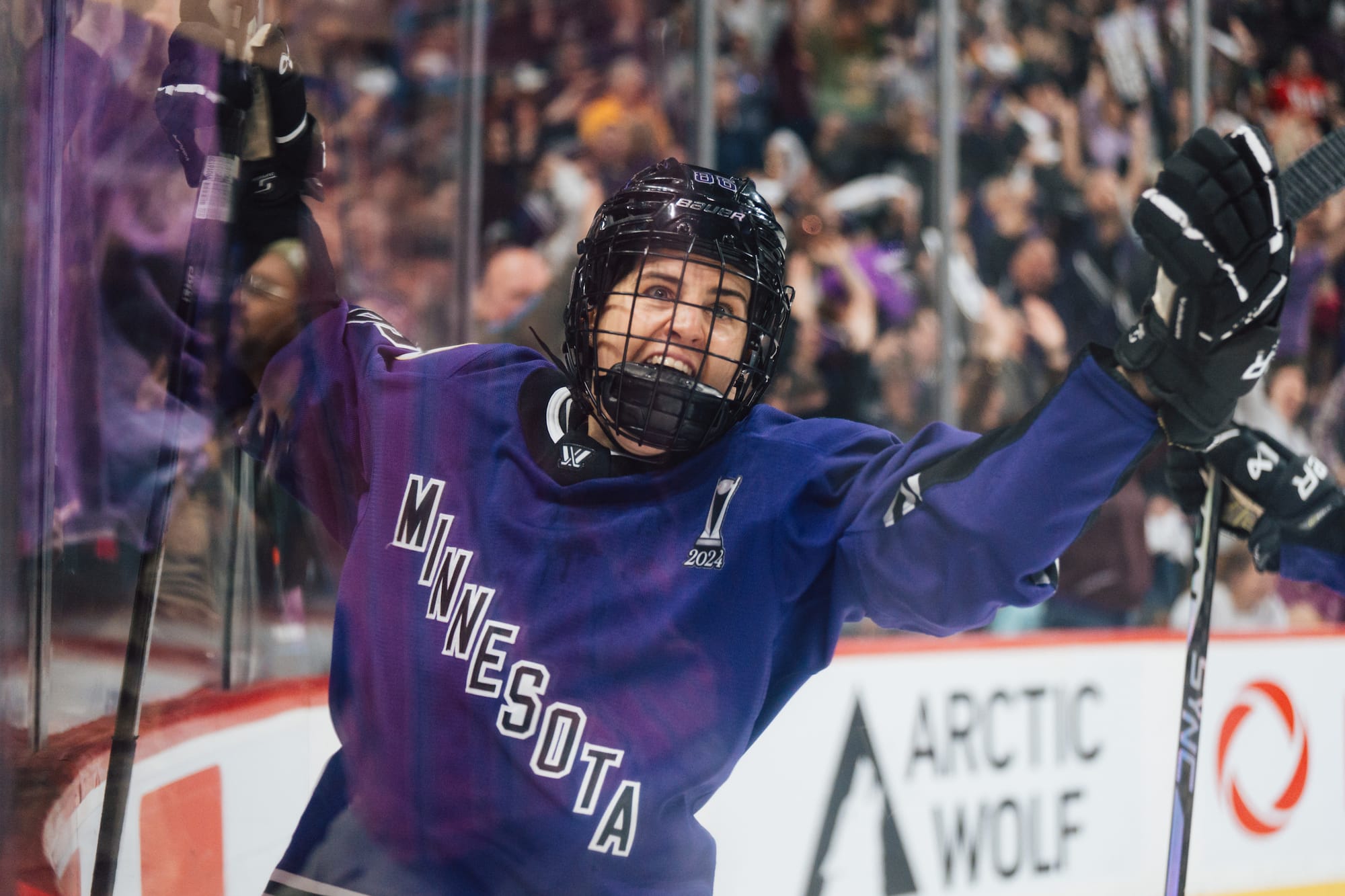
Two things that make the team from the Land of 1000 Lakes stand out: the striping pattern, and the purple. I like the three thin stripes on the arms and waist of the PWHL Minnesota jerseys. It stands out among the rest of the league’s jerseys, stopping another full-color cuff design from being the same as Toronto and Montreal. It’s also a little modern yet a little classic, a combination that I tend to enjoy in hockey design and specifically highlighted when I made my wish list for PWHL jerseys in my PHF review.
Minnesota also uses a great shade of purple as their base color. There should be more purple in hockey, period. It looks great on the ice, it stands out against other teams, and it’s a good symbolic color thanks to its association with royalty–appropriate for reigning champions PWHL Minnesota. I’m a big fan of the purple on these jerseys.
But like all of the Year One uniforms, this set is not without its flaws. The commitment to the diagonal text wordmark really hurts PWHL Minnesota, whose nine-letter location is just a little too long to fit successfully onto the jersey torso. The letters are too close together, so there is almost no separation between the outline of one letter and another. There’s a reason the diagonal text jersey is so maligned- it only works in specific circumstances, and this is not one of them. Speaking of specific circumstances, the design is significantly less effective on the white jersey compared to the purple one. The three purple stripes stand out less against the black and white than the white on purple, muddying the visual effect.
1. PWHL New York
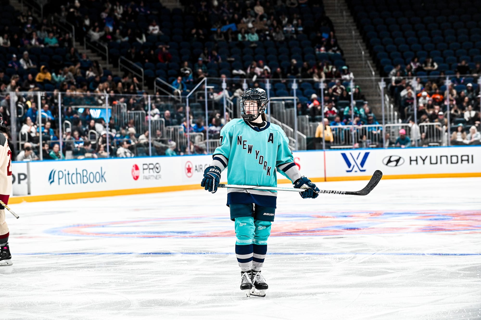
Of the six jersey sets, PWHL New York is the most successful. The design is clean and probably comes the closest to having character. The colors on the jerseys are a huge selling point. I love the teal shade, and it creates some nice New York area women’s sports synergy since the WNBA’s Liberty and NWSL’s Gotham FC also use blue-green in their branding. New York is also the only team in the PWHL to use navy blue, with the rest of the league relying on black for their dark accent color. I also enjoy the colorblock pattern on the sleeves, which is reminiscent of modern hockey design trends (see the Seattle Kraken and Vegas Golden Knights).
As for the wordmark logo, PWHL NY is probably the only team that can actually pull it off. The diagonal torso text for hockey jerseys is often associated with the New York Rangers and they’ve even had some alternate jerseys that say “New York” instead of the team name. The New York-area PWHL team using the same wordmark once again adds to the regional sports synergy. However, I’m not a fan of the teal outline on the navy letters for the white jersey. It minimizes the effect of the letters and creates weird blocks of blue-green around certain letters, like the W.
The text treatment on the white jersey is really the only fault I can find with the PWHL New York designs (minus the fact that the sleeve stripes don’t go all the way around the arm, but that bizarre effect is on all the PWHL jerseys). I say that it’s the best of the bunch.


Comments ()