
PWHL, Team Captains Provide Insight, Reaction on Name Reveals
More on the development of the six PWHL team brands.
On Monday morning, on the platforms of Good Morning, America and Breakfast Television the PWHL announced the names and identities of the league’s first six teams. After playing the first season without names or logos, the brand reveals came after a long build-up of anticipation and hope.
The PWHL hosted a media availability to react to the six new names and identities. The first speaker was Amy Scheer, the league’s Senior Vice President of Business Operations. She detailed the compressed timeline the league faced in developing six new team brands in a year, when the typical timeline for a single new team in pro sports is around 18 months. She spoke of the ‘small internal group’ within the league that led the search, collaborating early in the process with team GMs and players, which considered “hundreds and hundreds and hundreds of names.” She called the controversial six team names that were leaked last year “six in the queue that didn’t make the final cut.”
The PWHL’s Vice President of Brand and Marketing, Kanan Bhatt-Shah, spoke next about the design process. The league partnered with Flower Shop, a New York-based creative agency, on a strict timeline that was predicated on the need to have designs sent to jersey manufacturers in May. Bhatt-Shah talked about taking inspiration from the storylines of the first season, from in-depth discussions with fans, and from social media and chats on YouTube during games. She also described the criteria that her team looked at in choosing the names: they needed to inspire ‘pride of place’ and tie into the specific market; they needed to resonate with fans; and they needed to offer lots of possibilities for teams as they explore and build out their new identities in terms of visual opportunities and potential activations. Legal requirements– the ability to own trademarks in Canada and America– were also an important consideration.
Answering a question from The Ice Garden, Bhatt-Shah explained that the visual aspects of the brand identities were ‘upstream’ from the choice of names. The design team thought about the cultural influences and heritage in each market and how they may be represented on a jersey, and used those considerations in selecting the team’s names. They wanted to have continuity in the primary colors from the first season and they utilized color theory in designing how those primary colors could be expanded upon and tied into the eventual names.
Scheer said that the league “purposely decided there would be no Anglican version” of the name of the Montreal-based team, that their name would be in French “regardless of where they play.” She said it was important to have a name that felt relevant specifically in Montréal. Victoire captain Marie-Philip Poulin called the name and logo "sick" and said that her teammates love the name.
L’esprit de la victoire
— Victoire de Montréal (@PWHL_Montreal) September 9, 2024
The spirit of victory
📰FR https://t.co/HACYCUHVQQ
📰 EN https://t.co/HACYCUHVQQ pic.twitter.com/7C3oJbHaLe
While Scheer did not speak on the intentionality of having a name that could be bilingual in Ottawa, where ‘Charge’ serves essentially the same functions in English and French, she said that the same process and thought was involved in making the name “meaningful to the community” in Ottawa as with each team. Charge captain Brianne Jenner said her teammates are very excited about the reveal and that in hindsight, they appreciated the image of Gabbie Hughes that appeared in a teaser image last week, as “she charges the net quite a bit.”
“[Our team identity] in Ottawa, it’s not just a nod to the city and being the center of government, but it’s a nod to our fans as well, and I hope our fans realize that and embrace that. The electric energy that they brought in our first season is a big part of our identity.”
-Brianne Jenner
The league seemed to be hedging on whether design choices for the New York Sirens were influenced by the branding of the New York Liberty and NJ/NY Gotham FC, two professional women’s teams in the market which both utilize a teal palette, or the New York Islanders, which pairs blue with orange. Bhatt-Kahn expressed that “some colors just go together,” and referenced taxis and construction zones as New York tie-ins for the choice of orange. Sirens captain Micah Zandee-Hart said she is “not sure if there was intention behind” the similarity to the colors of the other women’s teams, but she does find it “pretty cool.”
“In women’s sports we’re all one right now, we’re all kind of feeding off each other and the support and energy… so it’s great to be a part of that, especially in New York… what sport means in the city of New York and the history of sport in the city, it’s cool to feel like we’re kind of tied to some of the other teams in a way, and I’m sure fans feel the same.”
-Micah Zandee-Hart
Bhatt-Kahn and Scheer described ‘Frost’ as a name that kept coming up internally and in conversations with fans, one that people seemed to like and one that made them smile. In response to a question, Scheer said there were “many” weather-related names that were considered. While there were a number of references to conversations with GMs and players throughout the league regarding team names and identities, Frost captain Kendall Coyne-Schofield said, “We were not involved in the process,” when asked how she and other Minnesota players were involved. Bhatt-Kahn described the palette as a monochrome look that the fans would get to “imbue with meaning.”
#PWHL Minnesota's logo anatomy includes icicles to embody the state's "embrace of the cold," sharp edges & points to reflect the team's endurance and intensity, and dimension to add texture & depth, "embodying the harsh beauty of the state's winters." https://t.co/Z58le798AN pic.twitter.com/bDtvSHwJMu
— Melissa Burgess (@_MelissaBurgess) September 9, 2024
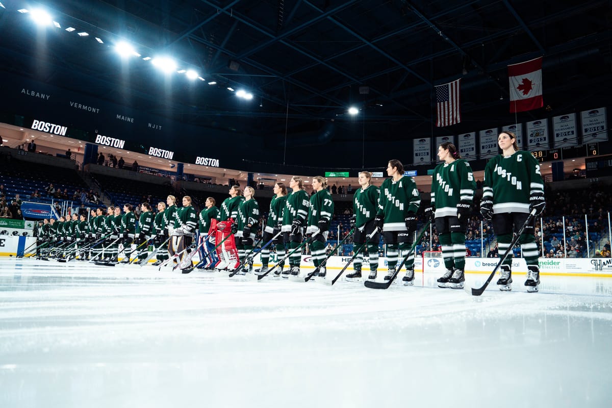
Bhatt-Kahn described the maritime influences that went into the design, referencing a number of well-known nautical landmarks around the Boston area, and described the Boston branding as focusing on unity, togetherness, and resilience. Boston Fleet captain Hilary Knight said that the league “did a really good job of keeping [the process] buttoned up.” Answering a question from The Ice Garden, she said the logo represents “embodies that relentless, passionate attitude of what it means to be a part of [Boston] and represent [Boston] on a professional level.” She also obliquely referenced the “nod to all the heritage there” in the anchor logo, which bears a resemblance to that of the Hartford Whalers.
“It’s really cool to be able to have something that you feel embodies the city to this extent.”
-Hilary Knight
Scepters captain Blayre Turnbull welcomed the new names and logos with some humor, saying, “It’s a super exciting day not only for the players to be able to finally say that we play on the Scepters, it’s a lot easier to say than PWHL Toronto.” She also spoke about the importance of the moment after all the support the league received in the first season: “These team names and our logos and colors, they represent more than just our team, they represent our cities and our fans.”
A closer look at our Sceptre. pic.twitter.com/VTNFdua20V
— Toronto Sceptres (@PWHL_Toronto) September 9, 2024
Answering questions from members of the media, Scheer said that the PWHL had consulted with the NHL on a few potential names that would require ‘co-existence agreements’ with NHL teams. Scheer also stated that using the names of teams from the Premier Hockey Federation, to which the PWHL owns the trademarks, was “not an option.” She said the PWHL wanted to build equity in their own names that would “be part of our history… and create a new history.”
Scheer provided some further information about the upcoming season: fans will be able to purchase replica jerseys with player names on the back as soon as the jerseys are announced, while authentic jerseys will not be available for retail until season three. Team venues are “just about in order,” and the league is “working on our broadcast deals.”
Scheer also said it’s impossible to make everyone happy, but she was not concerned with criticism. “I am very confident that we did things the right way… the next phase for us is waiting to see the fans bring the logos to life in the arenas… We’ve done our part, now it’s up to the fans to do their part.”


Comments ()