A (Semi) Definitive Ranking of 2024 Goalie Setups
Logos and jerseys are here, and so is the 🔥 gear. Which setup is the best?
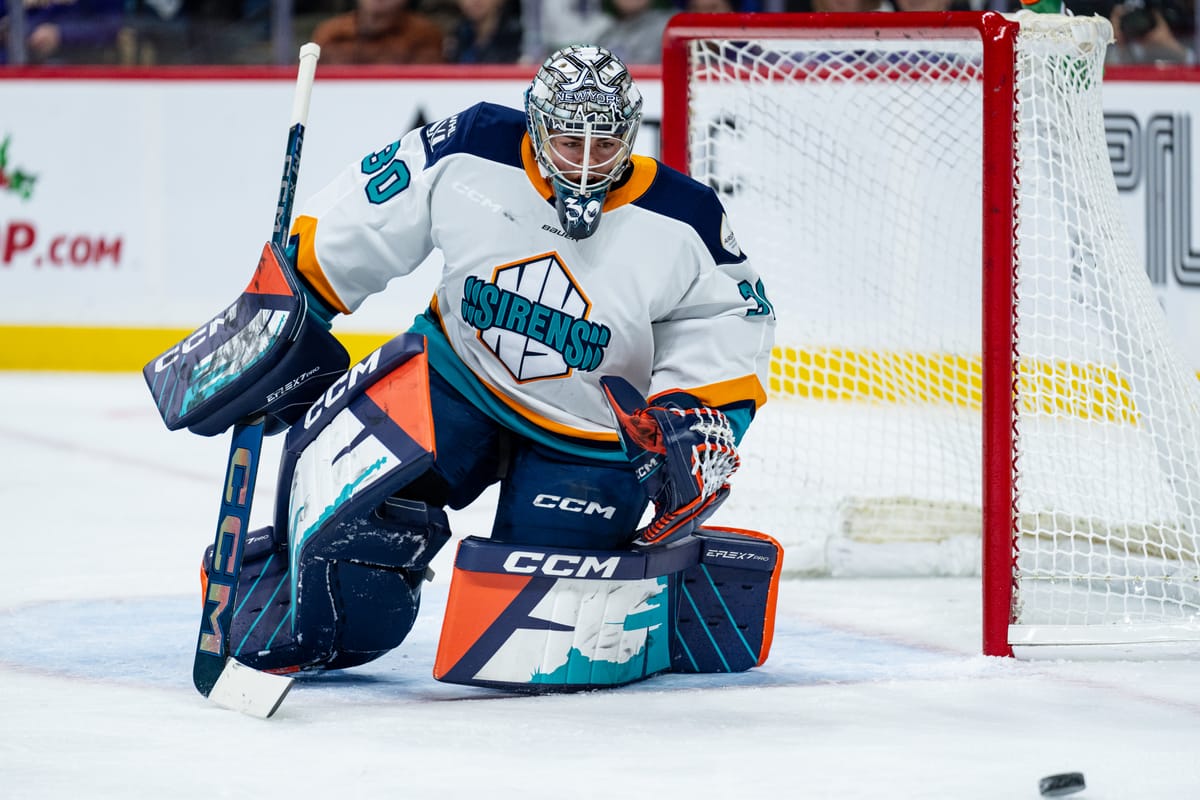
Now that the teams all have logos and identities, we've seen some pretty cool goalie pads hitting the ice.
As one of The Ice Garden's many goalies and someone with a lot of opinions, I thought it would be fun to share my definitive* ranking of everyone's setups for the 2024-2025 season.
*Some of the goalies haven't gotten their pads in yet, so I'll add them to the post in January.
Ottawa Charge
Gywneth Philips – 10/10
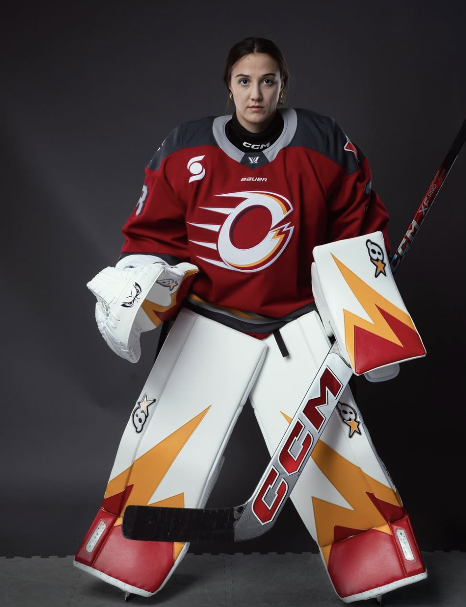
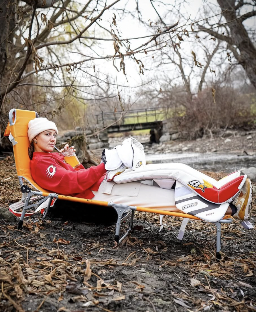
Credit: @gwynethphilips on Instagram
She may not be the starting goaltender this year but she is absolutely number one on the team in terms of setup.
I love the fire design and I think the colours really complement the Charge jerseys. The best part to me is that these are super simple. She isn't going over the top but they match her team and the vibe very well.
I am one of those people who thinks a simple setup is the best setup and I love white pads with some details. My only curiosity is that she has Brian's brand pads... that's pretty unique.
Bonus points because I love the Billy Smith photoshoot she did to show them off.
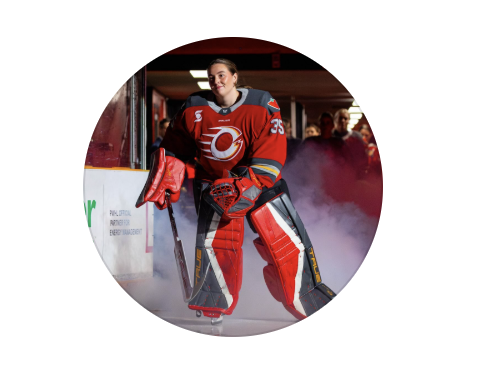
Logan Angers – 8/10
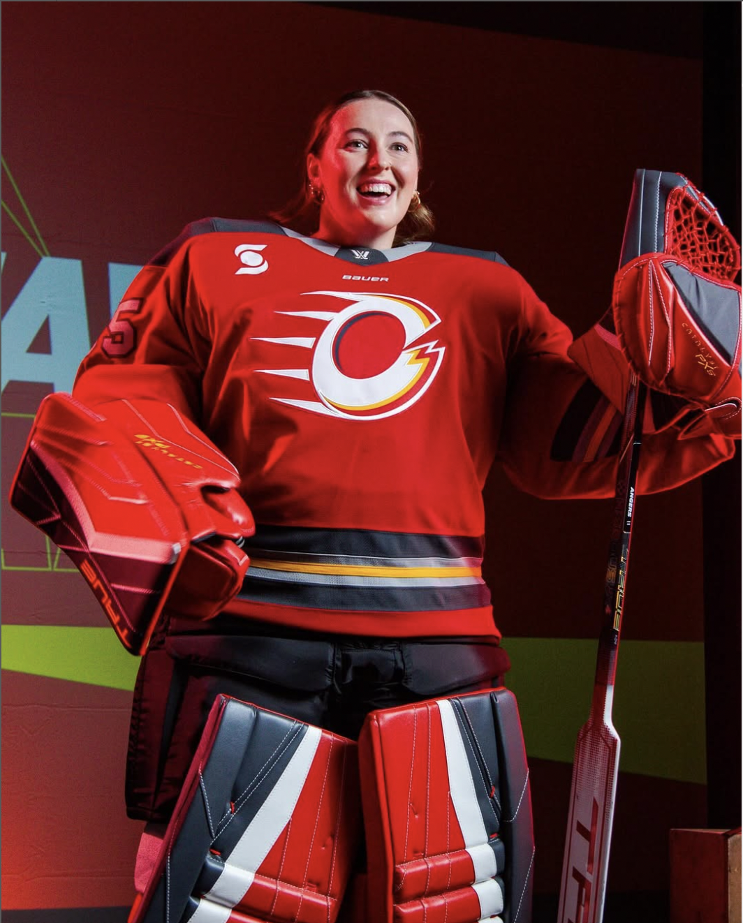
Credit: @loganangers on Instagram
Since most of the third goalies haven't played a game yet, it's hard to see their setup in action.
But, I love how Logan's gear matches so well with the dark jerseys. I also love the touch of having the yellow on the logo on her pads that matches the yellow stripe of the jerseys.
The setup looks really slick, but it's not something super unique. Bonus points for having the diamond shape of the colours, rather than just some small lines. It makes for a cooler design.
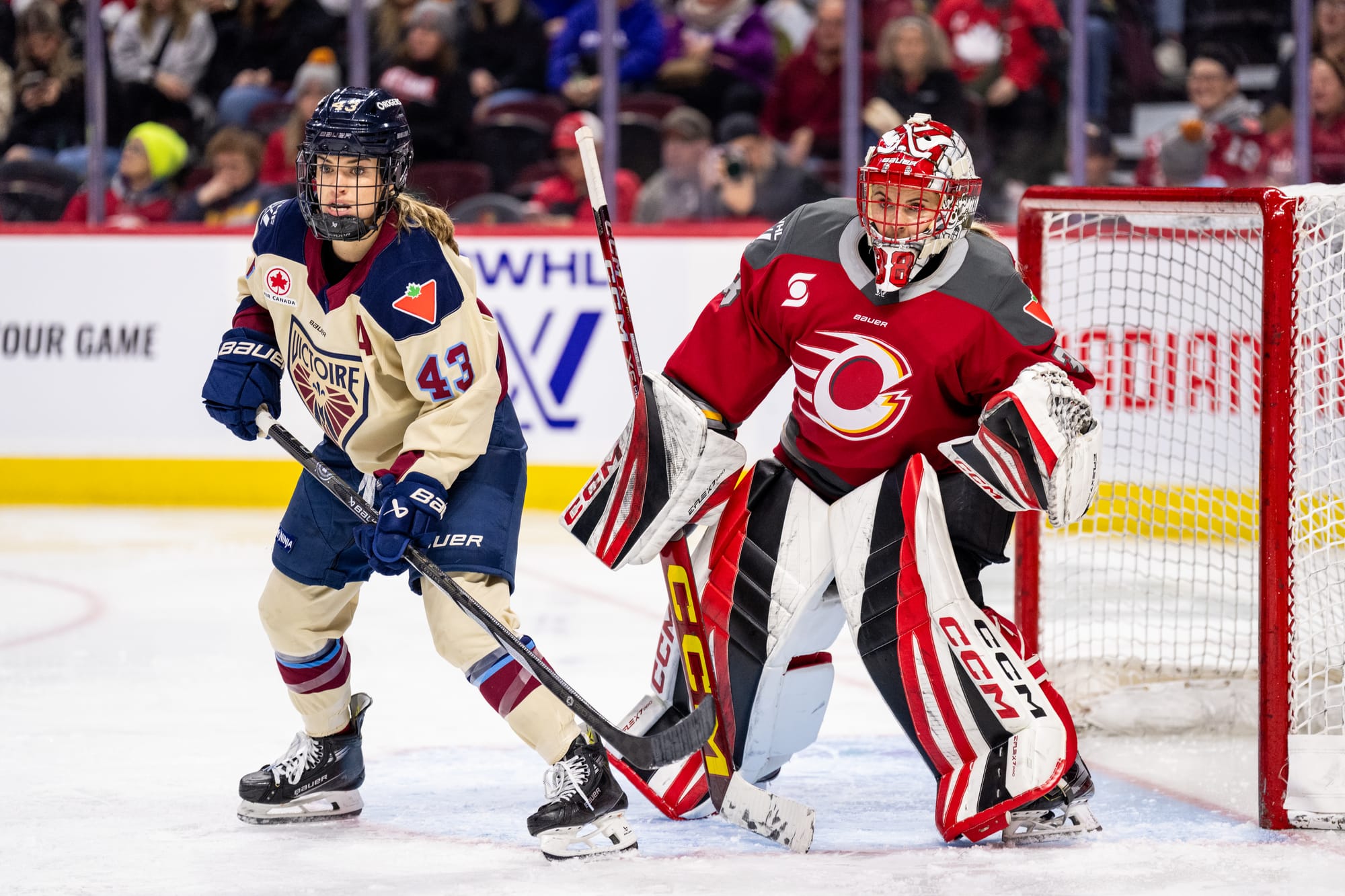
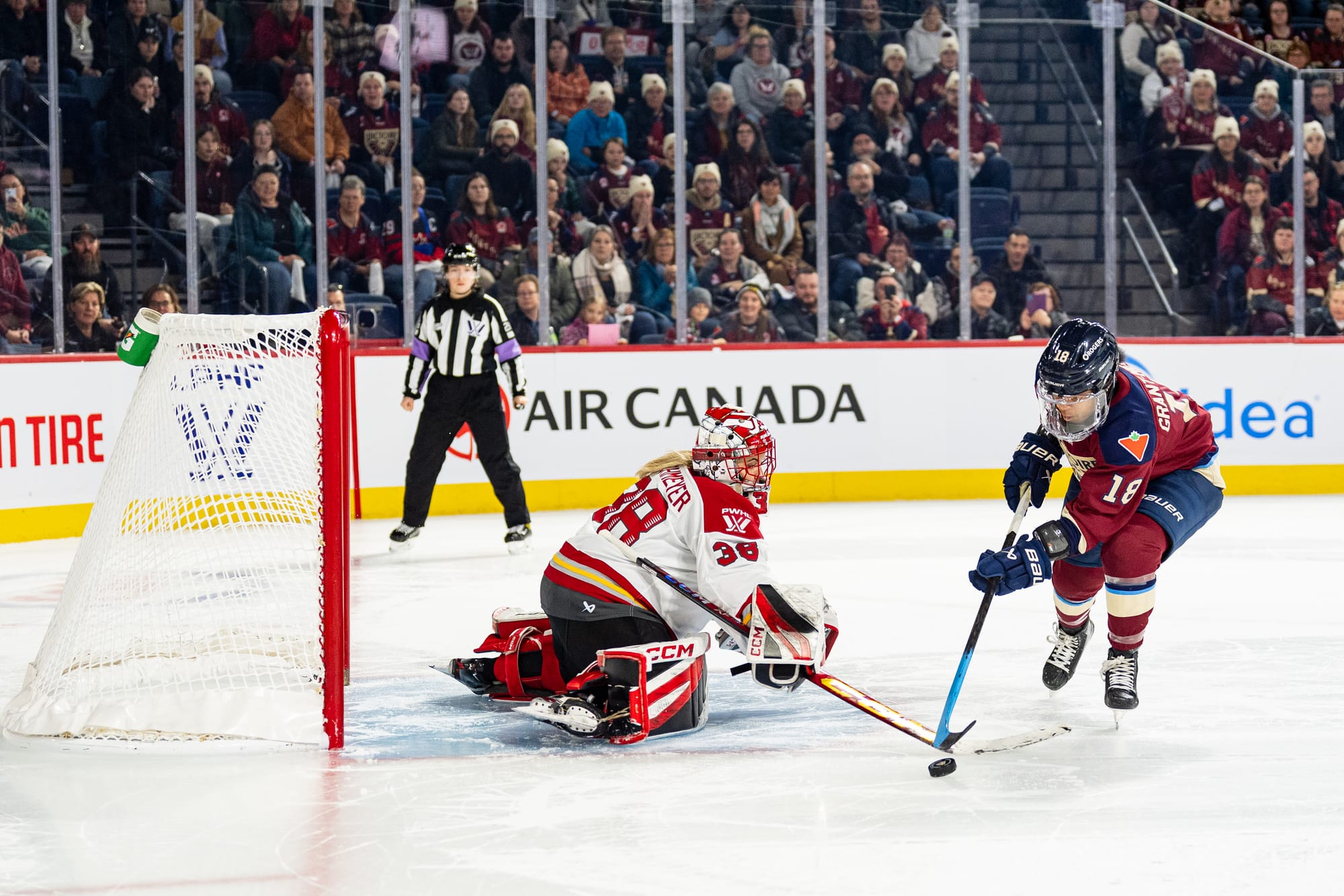
Emerance Maschmeyer – 8/10
Credit: PWHL
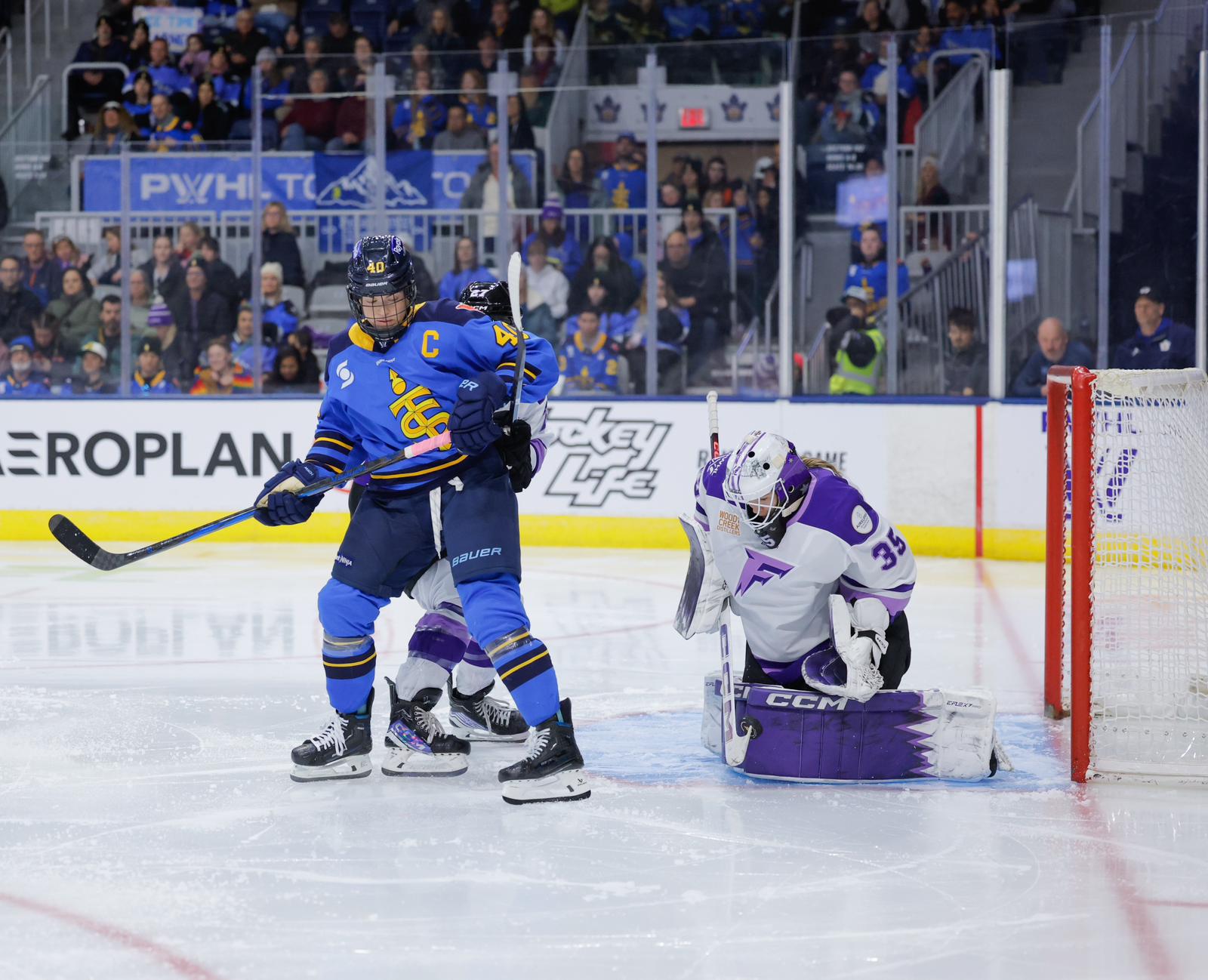
Logan and Emerance get the same rating from me. I don't think that Masch's pads are very groundbreaking, and for the starting goaltender, I was expecting a bit more.
I like that they have more white on them, I think it makes them look a bit more slick than Logan's. And, unlike Logan's, I think they look best in the white jersey (even though she's probably getting scored on in this pic, sorry queen). Bonus points because they do match her mask really well (and will probably match Team Canada for the international games).
Unlike Logan, she doesn't have the yellow detail on the pads, but she does have it on her stick, which is my favourite part of the setup.
Toronto Sceptres
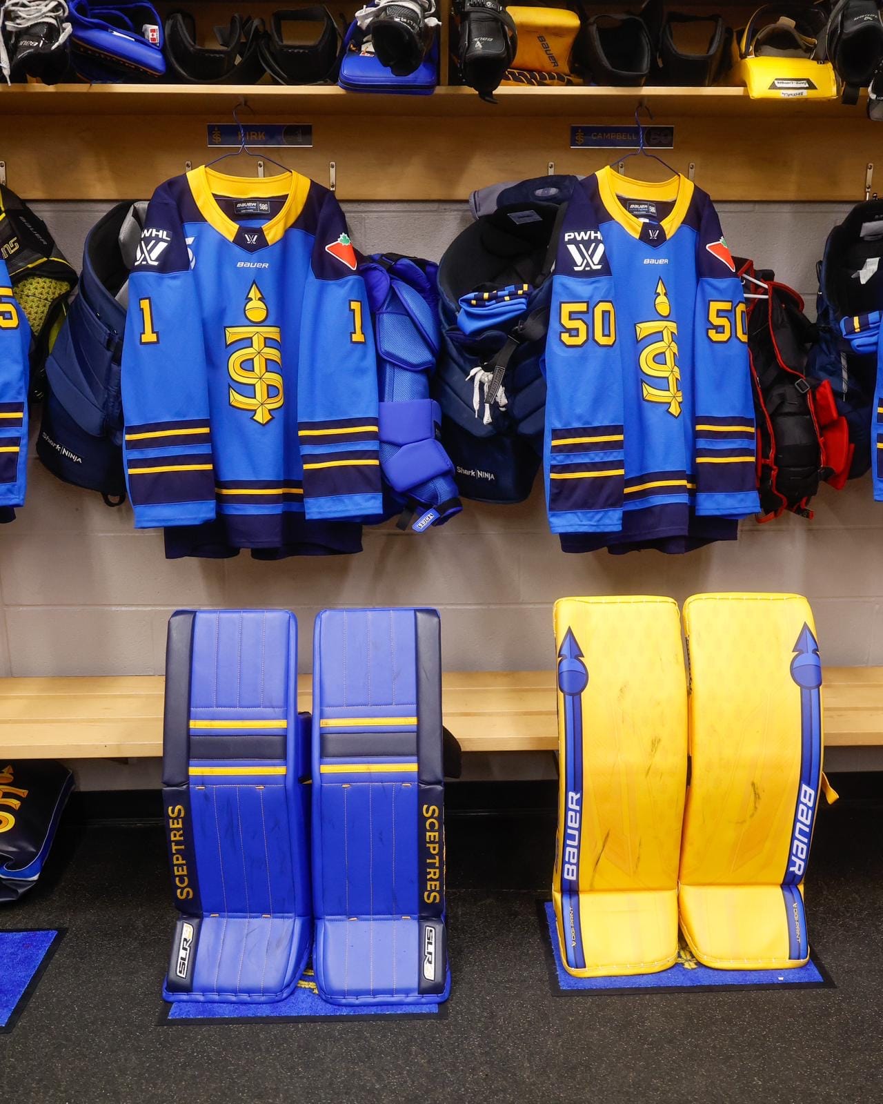
Raygan Kirk – 8/10
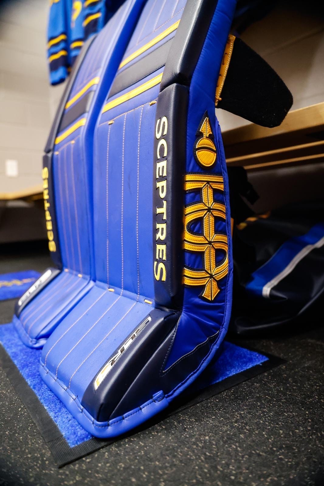
Credit: Toronto Sceptres
Okay, Raygan went OFF with this one.
As you'll read next, I strongly prefer solid blue over solid yellow, so Kirk already takes the cake with these ones. I also love a retro style (again, more on that later), and I'm obsessed with the retro feel of these pads, especially with the stripes across the knees.
But two things make these superior to any of the other Toronto setups (and some of the non-Toronto ones too). The first is the pinstripes. I love a pinstripe moment, whether it's on clothing, a jersey, or goalie pads. It's such a cool way to add a subtle yet impactful element.
The second is the Sceptres logo on the side of the pad. It's such a tasetful way of adding a logo.
Bonus points for the Sceptres wordmark on the break. I'm glad Vaughn let her do that, I think it looks better than the manufacturer logo.
Kristen Campbell – Away Pads 7/10, Home Pads 5/10
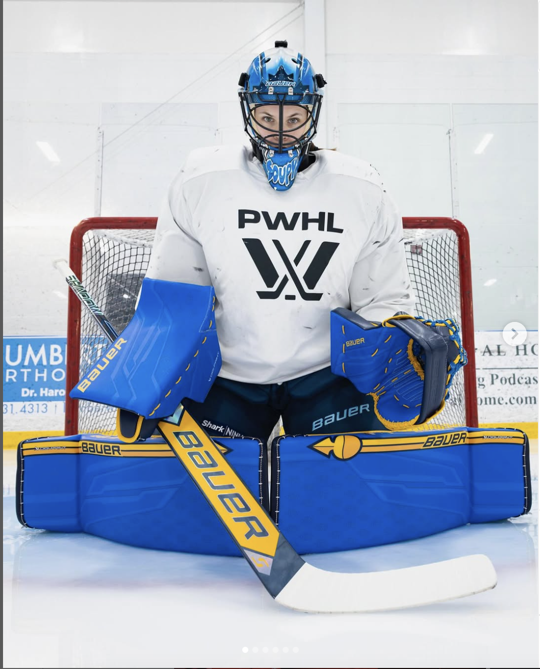
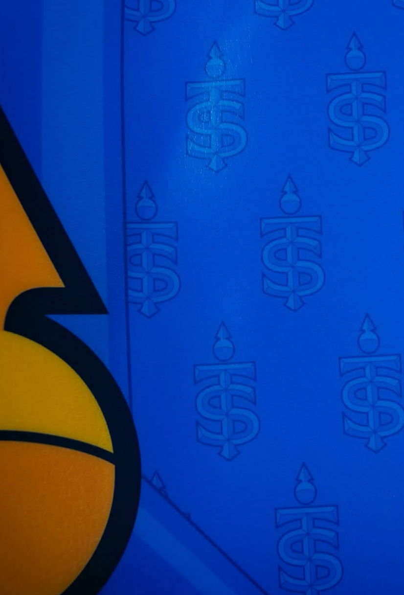
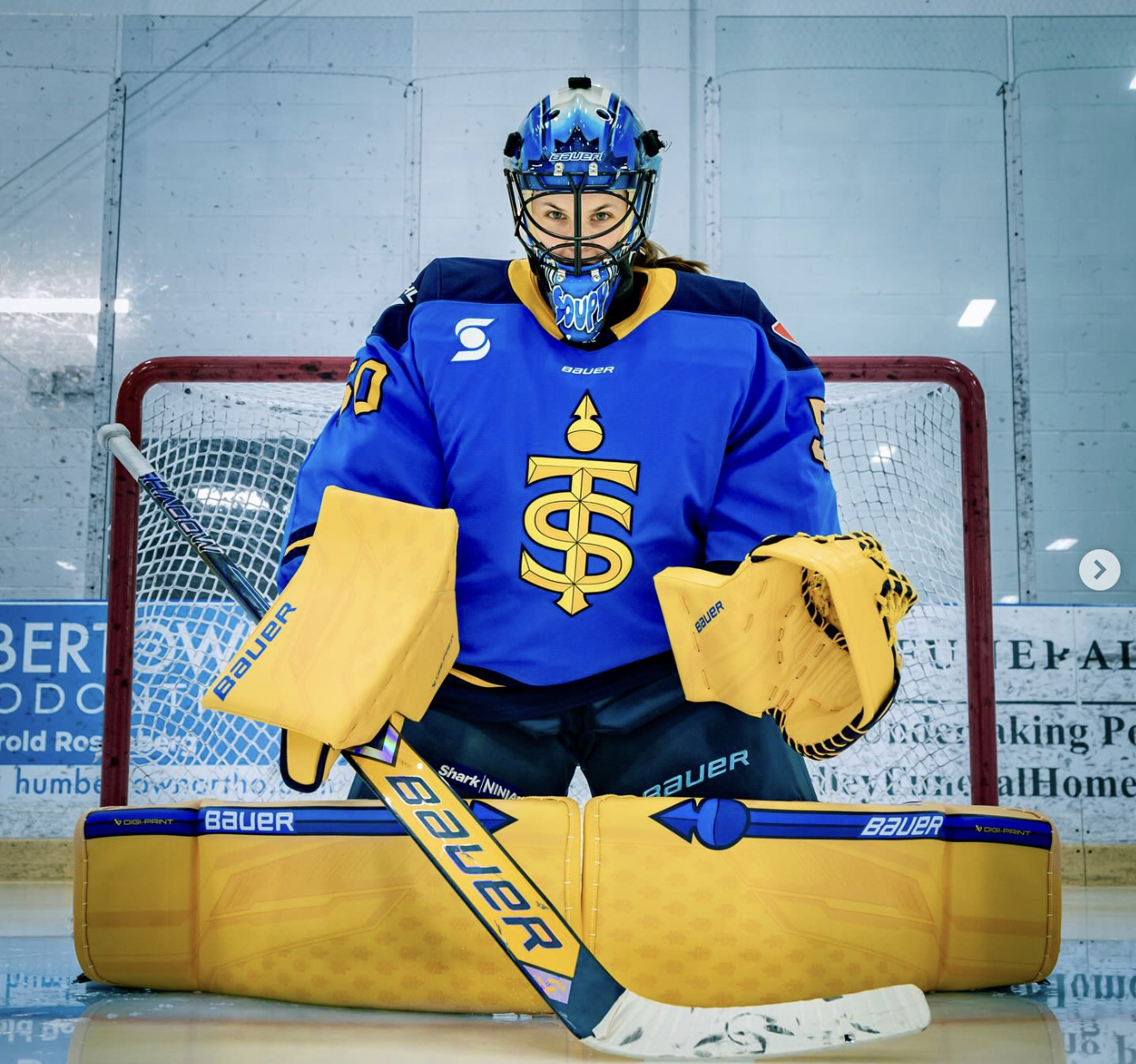
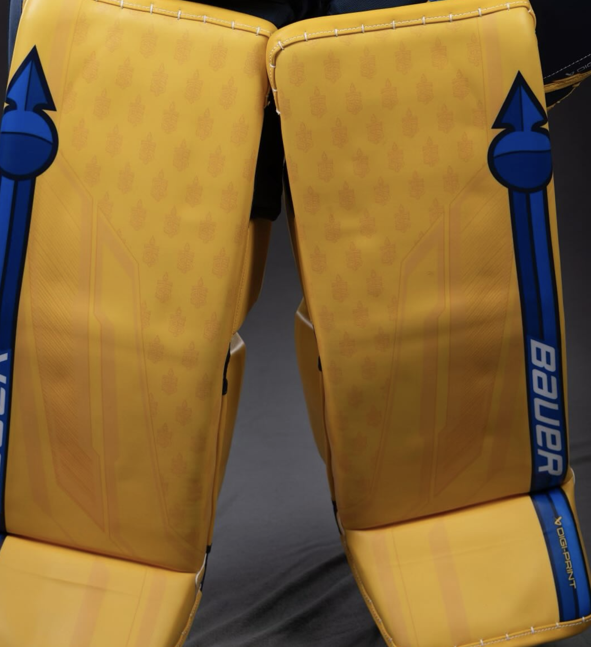
Campbell's away pads (top) and home pads (bottom). (Credit: Heather Pollock)
You're probably thinking, they are the same just reverse colours, why do you have such a different feeling about the second one?
As a yellow goalie pad wearer myself, I love the colour of the home gear. But I do not like how much of it there is. The full pad set and gloves being the yellow/gold is just too much for me.
The away gear has the same level of detail (I'll get to that in a minute), but the colour is a lot cooler and less garish. I also think blue with a bit of yellow looks better than yellow with a bit of blue.
In terms of the details, both sets are really slick. I love that they have the mini Sceptres logo as a kind of pattern to jazz up the solid colour. On the yellow ones, they look like wheat stalks to me, which is weird. I like the more muted detail on the pads, which looks a bit like the PWHL logo and a bit like the Wisconsin logo, which is where Campbell played in college.
And of course, I love the Sceptre on the side which also looks like the CN tower. The yellow thread detailing on the home gloves is A++ and I love the yellow stick more with the solid blue ones than with the solid yellow.
Carly Jackson – 7/10
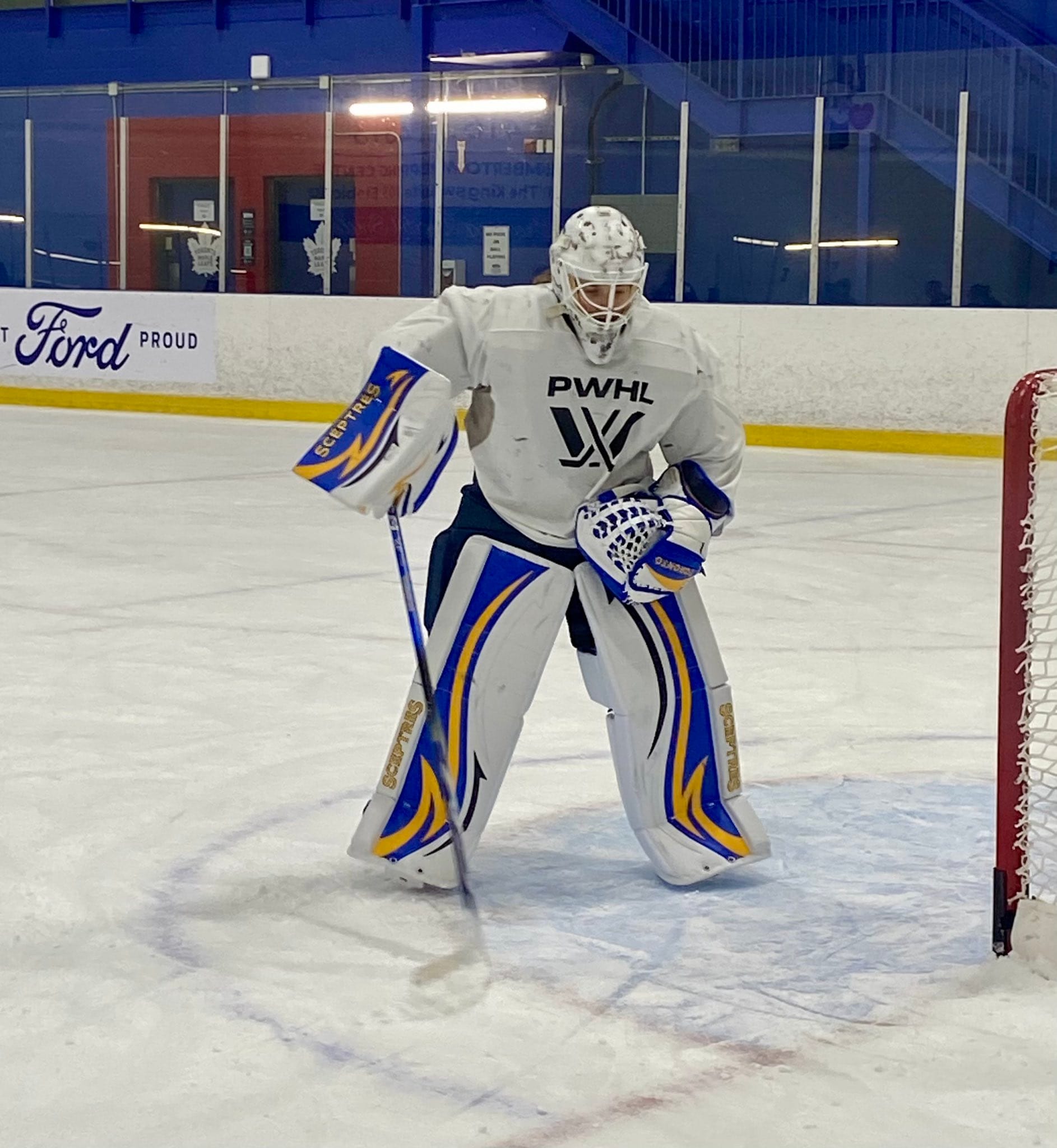
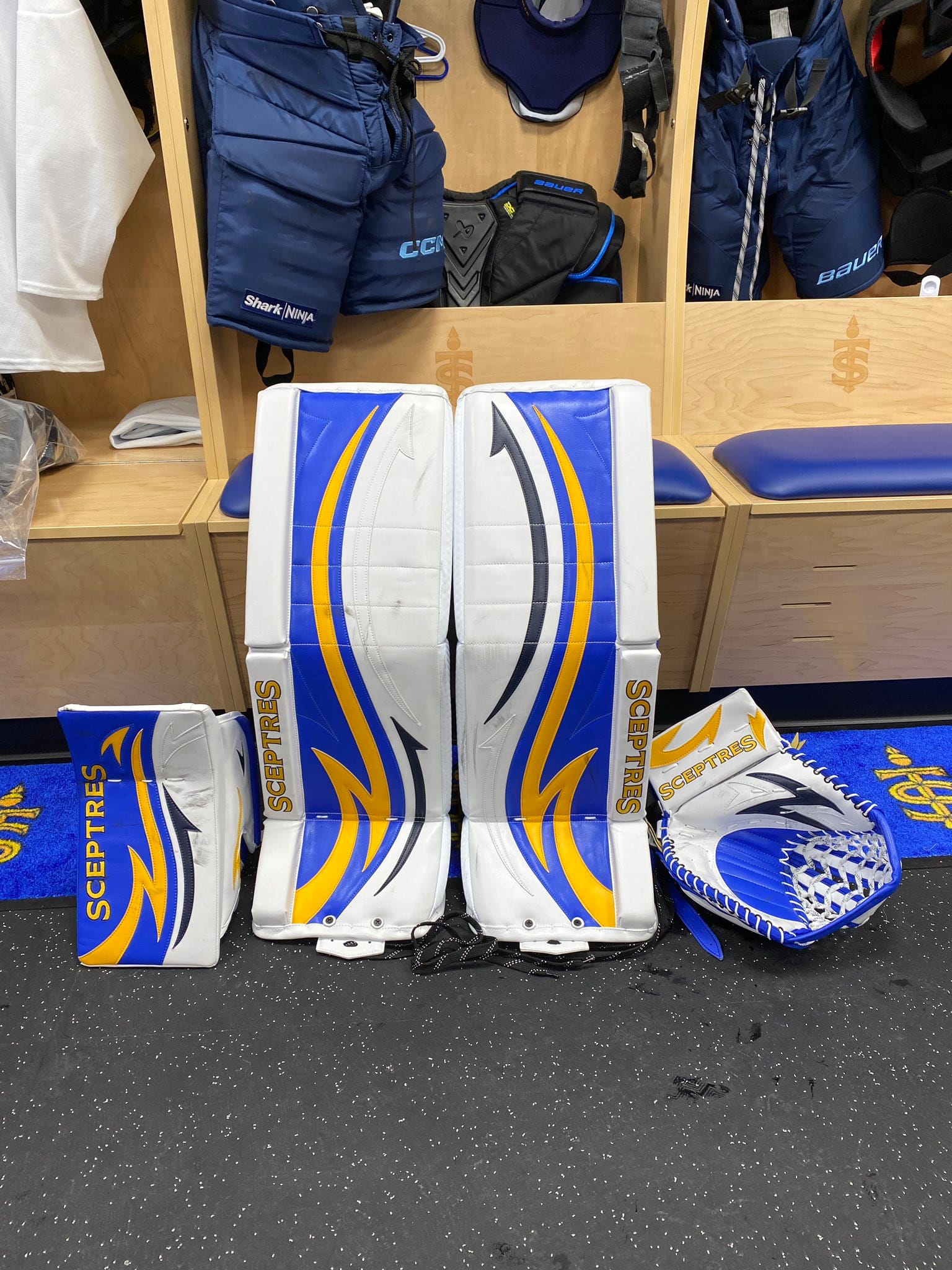
Picture 1 credit: Curtis Martin, Picture 2 credit: Toronto Sceptres
I originally had CJ slated higher but then I realized those were her pads from last season, and I was disappointed.
I love the retro look she had last season, but I understand wanting a change.
The new setup is designed in honour of Jonathan Quick's pads that he wore when the LA Kings won the Stanley Cup in 2013-2014. In an article with The Hockey News, CJ said that they loved Quick growing up, so this homage to his gear just makes sense.
Unlike Quick's pads, which are a boring grey and black scheme, the colours of the Sceptres jerseys really shine on CJ's setup. I love the detail of the Sceptres wordmark on the pads and gloves.
CJ also got a new helmet since these photos were taken, and although I love the white with the puck marks, the new helmet is so fierce. I love the industrial details on it.
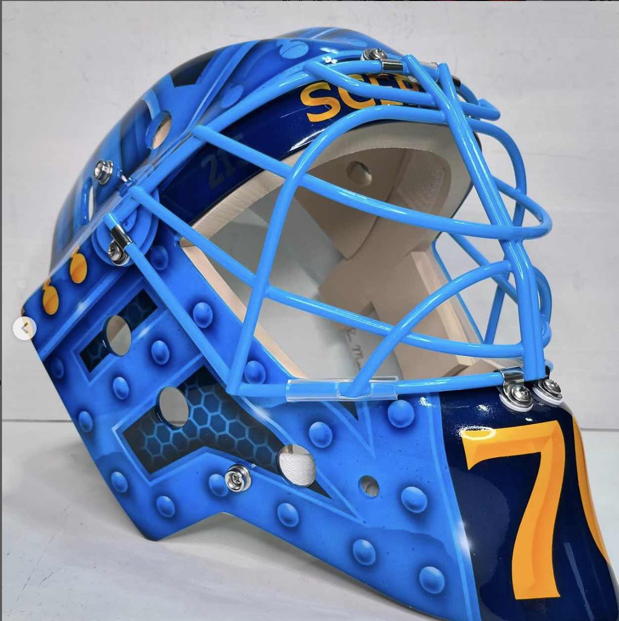
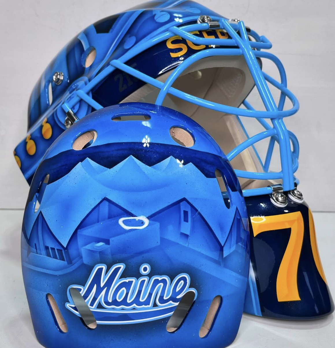
Credit: Vice Design
Montréal Victoire
Ann-Renee Desbiens – 10/10
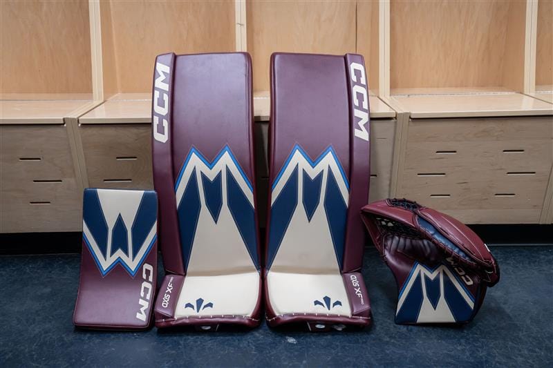
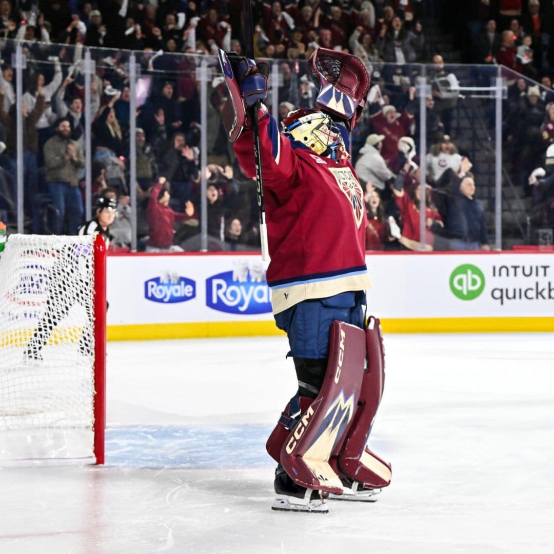
Credit: CCM/PWHL
She is the GOAT, so it's unsurprising that she has one of the best setups of the season.
I am a burgundy gal so I love these. Montréal has the best jerseys in the league, and these pads complement them so well.
I love the section of the logo that she chose, highlighting the M for Montréal. The cream really gives a retro look, which Desbiens says she always looks for in her gear. The fleur-de-lis is a nice touch on the toe as well.
Even though the setup is quite simple, it matches the vibe of the jerseys so well, and it has the same kind of mini logo patterned background as Campbell's pads.
Sandra Abstreiter & Elaine Chuli
Sandy and Elaine are both using the same pads as last season, which is totally fine. We might see them get some new setups in January, so stay tuned!
Minnesota Frost
Maddie Rooney – 10/10
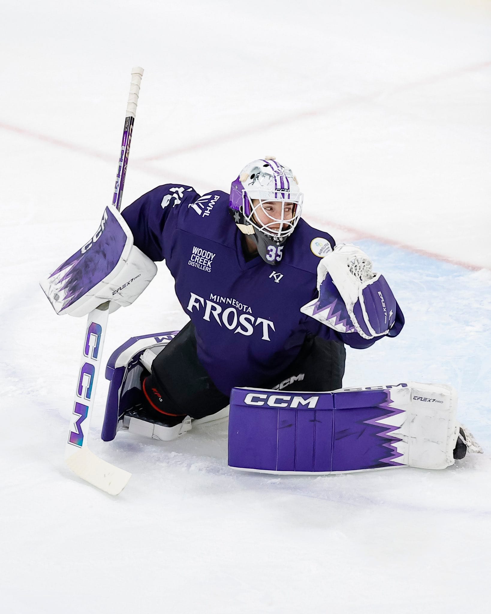
Credit: PWHL/Minnesota Frost
Honestly, Maddie Rooney has outdone herself with this setup. There are just so many details that make this set so fresh.
Firstly, the colours are so strong. I love how she has the darker and slightly lighter purple, similar to the jerseys. I really like that in the jerseys so I'm glad she included it. I think it compliments the zigzag/pointy design on the lower third of the pads. The white toe is perfect as well. It looks very clean and goes well with the dark and light jerseys.
I love that the pad details are mimicked on the glove and blocker. The blocker especially looks so cool with the zigzags and the colours.
Lastly, I love the holographic details on the CCM logo on the stick.
It would have been neat to see the Frost logo somewhere on the gear, but it might have made it too busy, so I prefer the simplicity here.
Nicole Hensley – 8/10
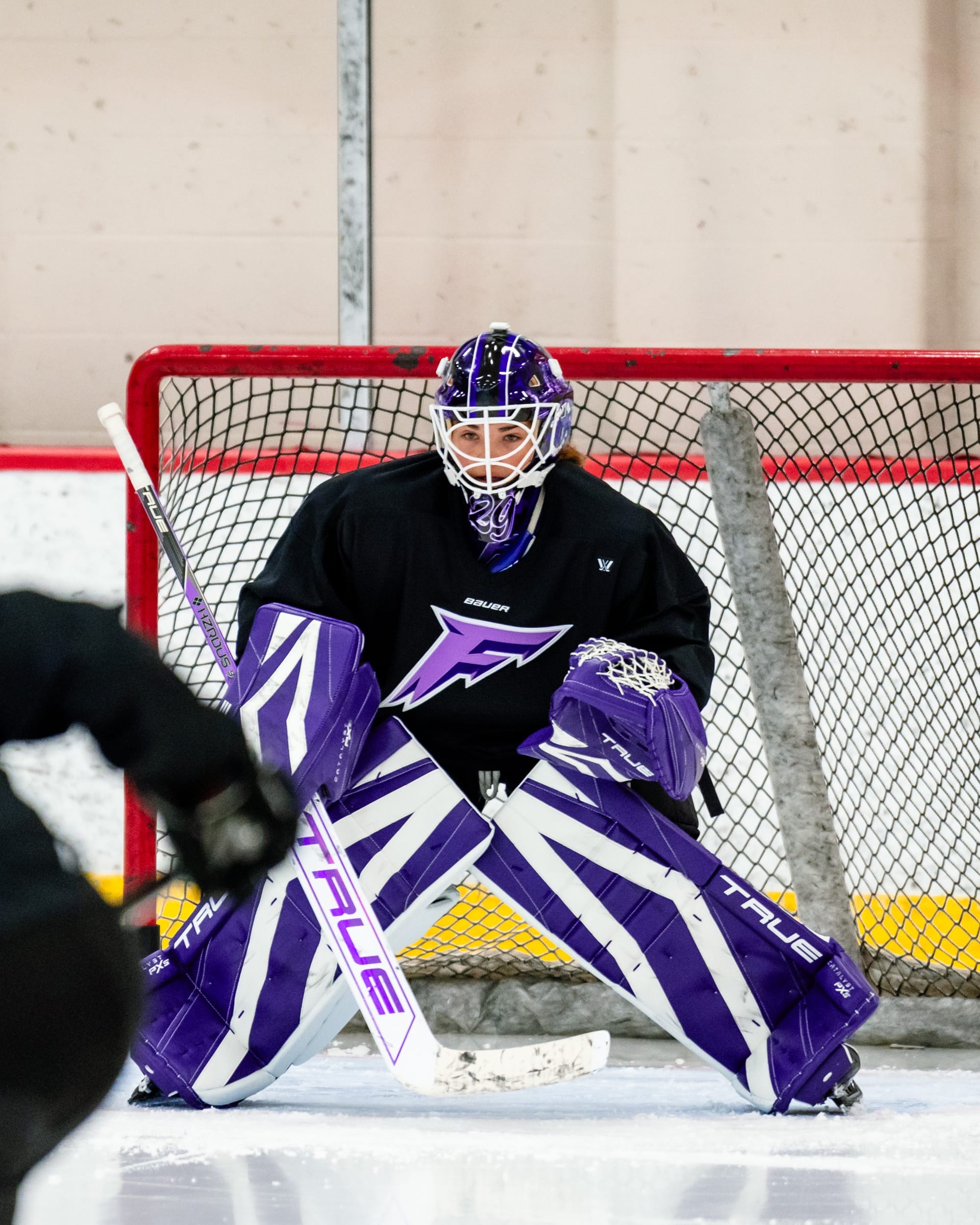
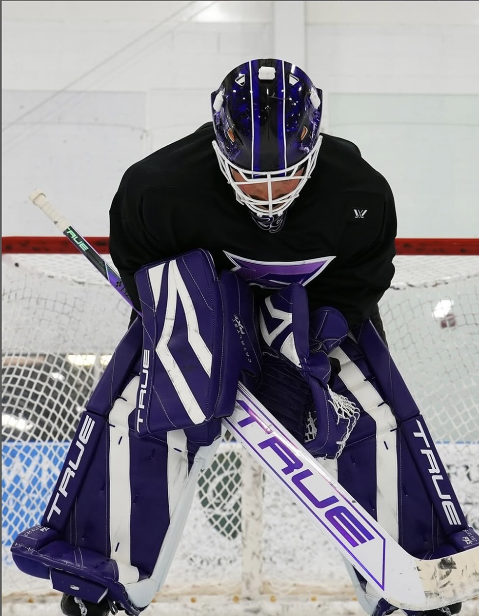
Credit: Minnesota Frost | True Temper Goalie
I think Hensley did a great job with her setup too. It's pretty simple, but I like the pattern on the pads, it's quite unique. Dark purple is just a colour that should be on way more uniforms and pads in the future.
It would have been cool to have some of the lighter purples on the gear (other than in the stick), but I think they are a solid look. And, like Rooney's, it's lacking in logo placement.
Bonus points for her mask, I love how shiny it is.
Lucy Morgan
I haven't been able to find any images of Lucy's pads. Maybe she'll have a pair in January.
Boston Fleet
Emma Söderberg – 10/10
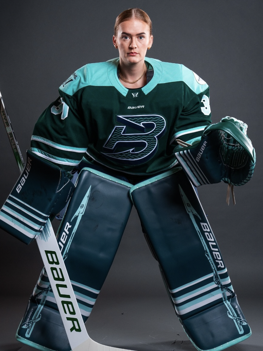
Credit: Quartexx.WHockey & Kelsey Durham
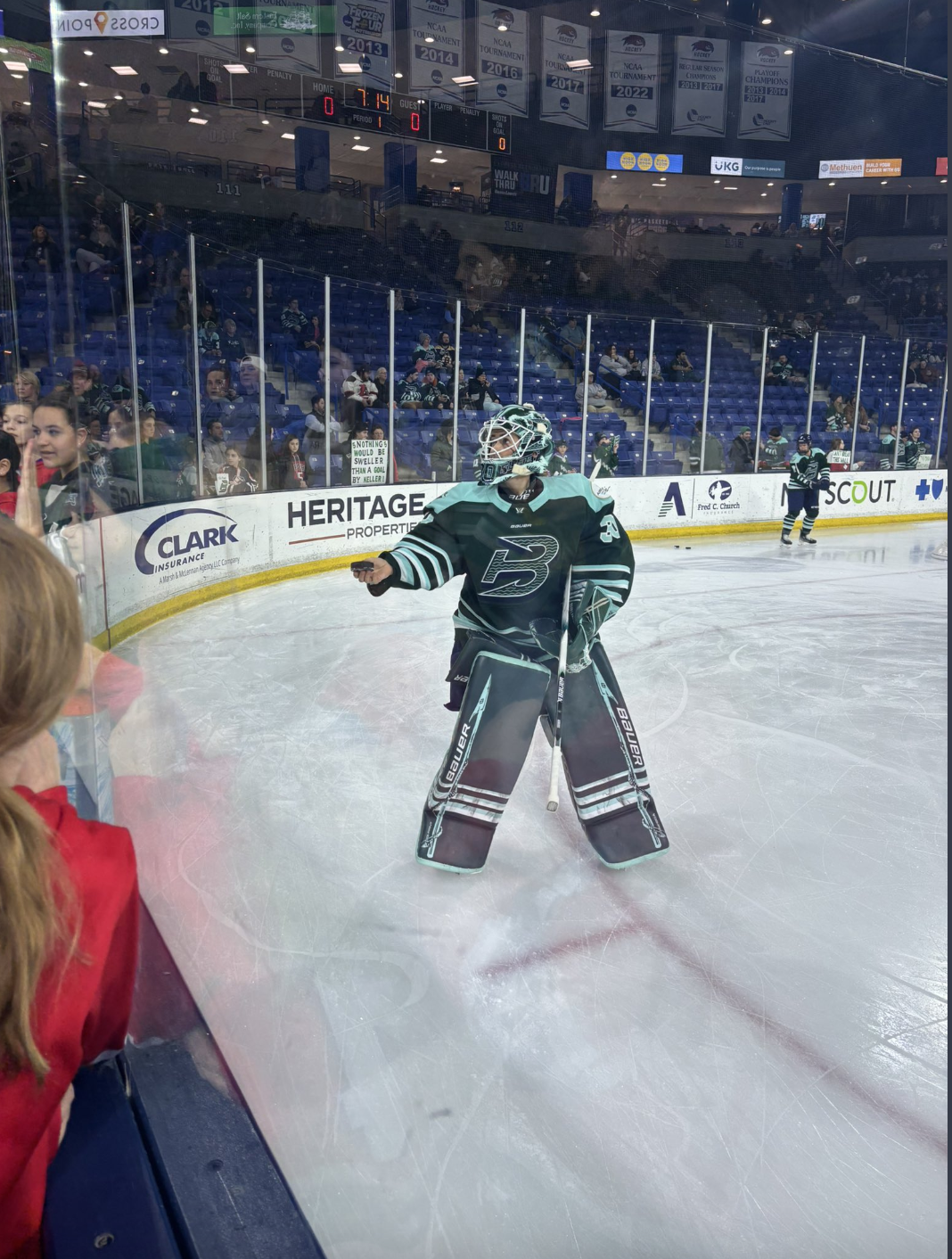
The biggest crime about these pads is that there are no photos!! Kelsey snapped this pic for me and Quartexx tagged Emma in the other photo but I've been able to find very little evidence that these pads exist and they are amazing. They deserve to be seen (and Emma deserves some starts).
Anyway, Söderberg and Frankel went for similar setups but I really love how Söderberg added these fishing spear-type details to the sides of the pads and the anchor detailing. It's super unique and goes really well with the Fleet theme.
I love that the horizontal stripe theme continues onto the glove and blocker. They also really complement the insane number of stripes that these jerseys have... but in a good way.
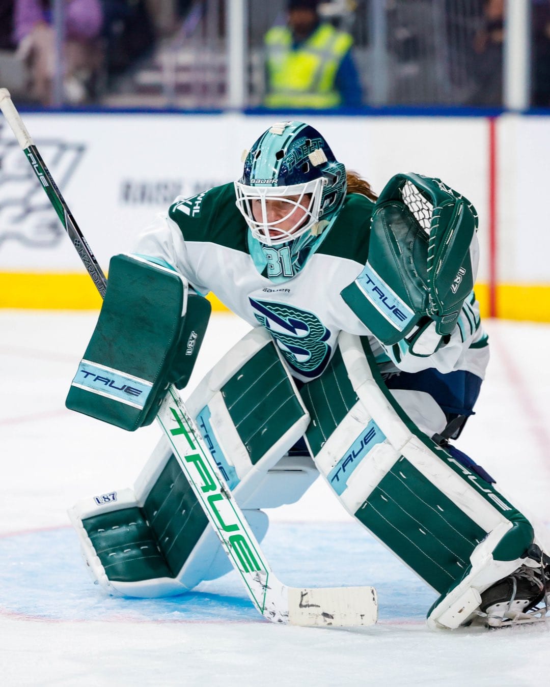
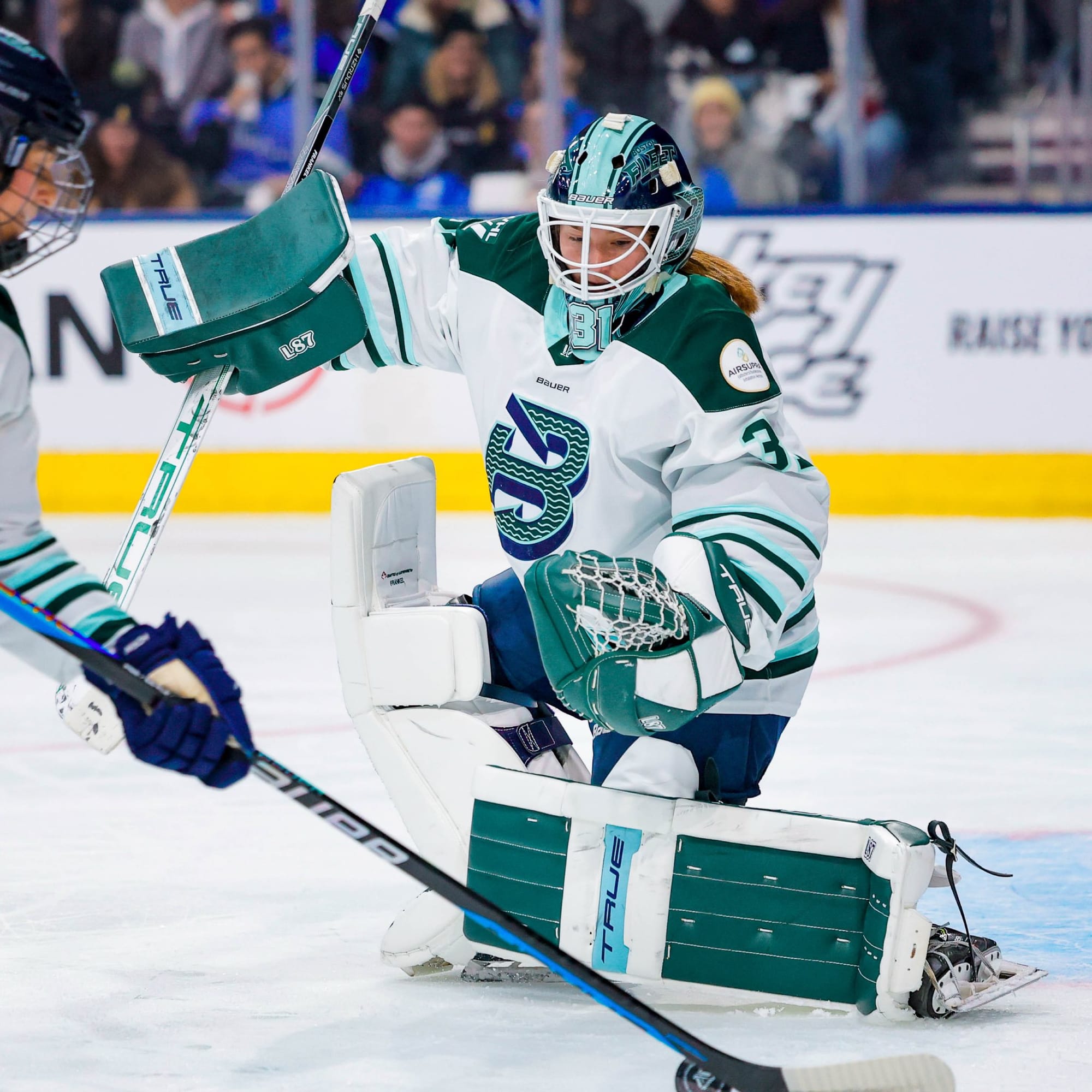
Aerin Frankel – 9/10
Credit: Boston Fleet
The Boston tandem really outdid themselves this year.
We've got the pinstripe style that I like from Kirk's pads, and I like that she used a white base, rather than a dark base.
It's clear from some of the older photos that Frankel added the teal stripe after the jerseys were released, but it doesn't look out of place. It really compliments her mask.
I understand the need for a change, and I like how they match the jerseys, but I miss the retro style that Frankel had last season.
Aerin Frankel? Very demure. 💚 pic.twitter.com/zEfOdRFAKv
— Boston Fleet (@PWHL_Boston) September 20, 2024
Klara Peslarova
Klara told me that she started the year with her national team pads, but she's hoping to debut her new ones in January. Stay tuned!
New York Sirens
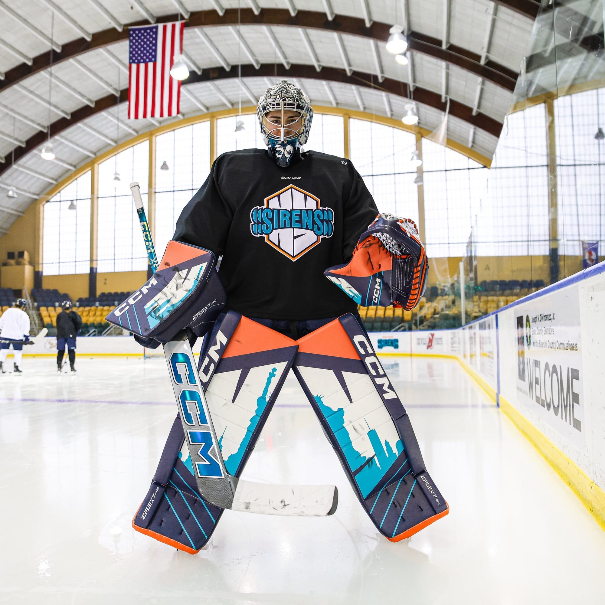
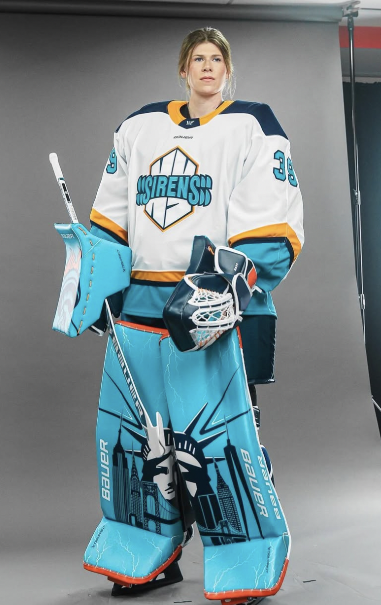
Corinne Schroeder – 10/10

Credit: PWHL | New York Sirens
Going into this article, these were 100% my favourite pads.
I'm a sucker for a skyline so it's an easy choice for me to like these. But the thing that sets them apart from Levy's pads, which I also love, is the use of the orange.
I know the orange is polarizing, and some people aren't a fan, but I think it fits really well with the 'Sirens' idea and I love how Schroeder uses the orange in her pads.
I think the diagonal stripes are a nice touch too. These are super unique and I love them.
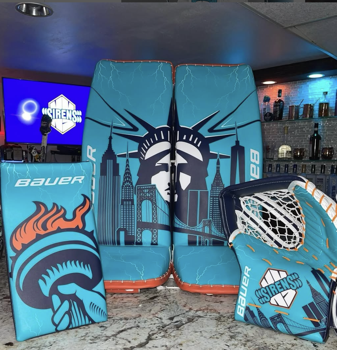
Abbey Levy – 9.5/10
Credit: Abbey Levy
Schroeds and Levy showed UP this season (at least, for their setups).
The best part about these for me is the blocker. That Statue of Liberty torch moment? Perfection.
Another skyline makes an appearance, so that earns points in my books too. I like the nice touch of the lightning, but I do think that would make more sense for the Charge.
The full teal is a little much, so I don't like them quite as much as Schroeds', but I love how the orange toe compliments the look.
I'm really hoping we get to see these pads in action at some point this season!
Kayle Osbourne
So far it looks like Kayle has been wearing her Colgate gear, but maybe we'll see a new set in 2025.
Overall
I really thought that Schroeder was going to come out of this article with the best pads, but seeing them all in front of me, I think I'd give it to Desbiens or Philips.
My least favourite setup is Carly Jackson's, which makes me sad. Honestly, none of these are bad, and they are way more unique than the NHL. I just don't love the thin stripes in a weird pattern.
New York is the top team for me in terms of style. Schroeder and Levy both crushed it.
Ottawa is the lowest ranked for me. Yes, they all have nice pads, but with the exception of Philips, there's really nothing that screams Ottawa or Charge for me.
I'm looking forward to seeing what the third goalies bring for 2025. Will they show up any of the starters?


Comments ()