
The Best and Worst Jerseys From Every NCAA Conference
Forget the national championship- which college hockey team is the best dressed?
Happy Frozen Four weekend! It’s been a great season of NCAA women’s hockey, but it all comes to an end tomorrow when the national champion will finally be crowned. I watched a good handful of games this year, and as much as I love to follow the action on the ice and the players’ skill, I always pay some mind to each team’s uniforms. Thus, as TIG’s resident jersey aficionado, I’ve decided that as we wrap up the season, it’s time to round up the best and worst jerseys in the NCAA.
AHA
The Best: Robert Morris
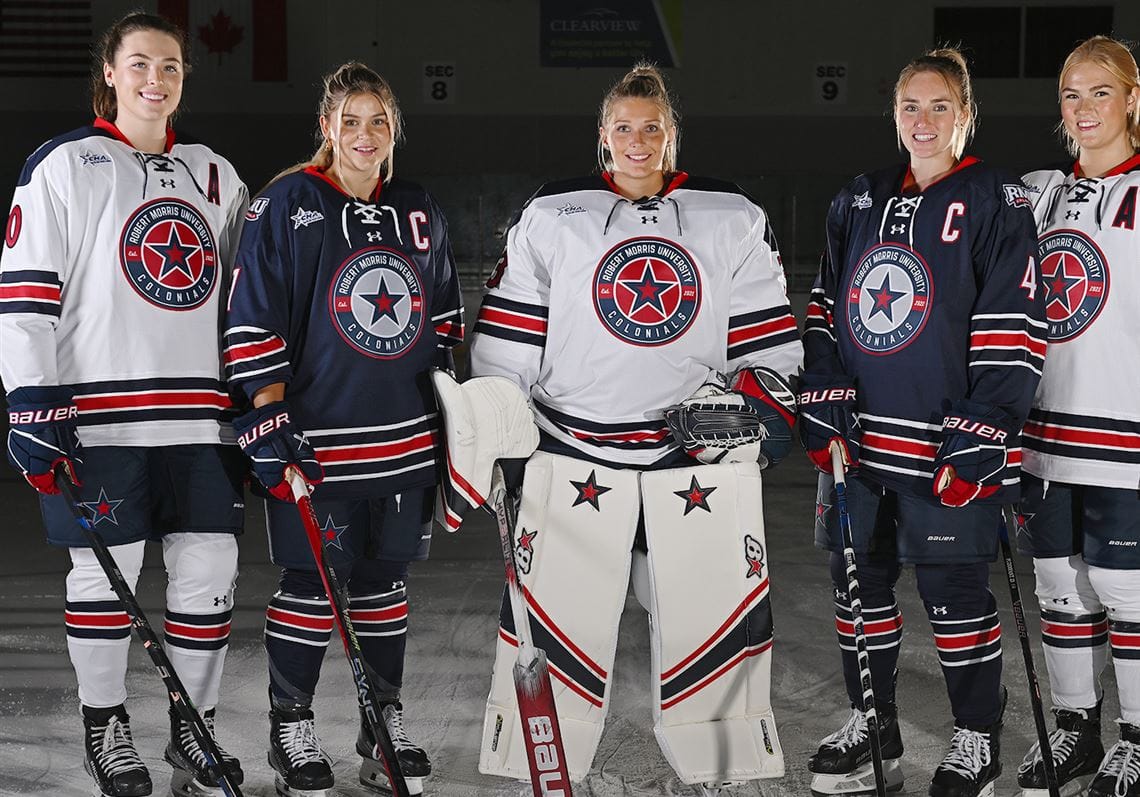
The Colonials may have been last in the conference standings this season, but they top my charts for the best jerseys in the AHA. It’s hard to go wrong with some classic red, white, and blue, and the patriotic palette matches the team’s name. I appreciate that the school’s colors rely on a darker navy blue, which helps the red accents pop. Roundel logos are hit or miss for me, and there might be a few too many words on RMU’s crest, but I like how striking the star is and appreciate that it shows up as a decal on the pants, too. The jersey design itself is simple but effective, with a classic triple stripe pattern. The rounded navy shoulder yoke on the white jerseys works, as does the RMU shoulder patch. The laces and the interesting number font pull it all together for a look that is striking without being overwhelming.
The Worst: Penn State
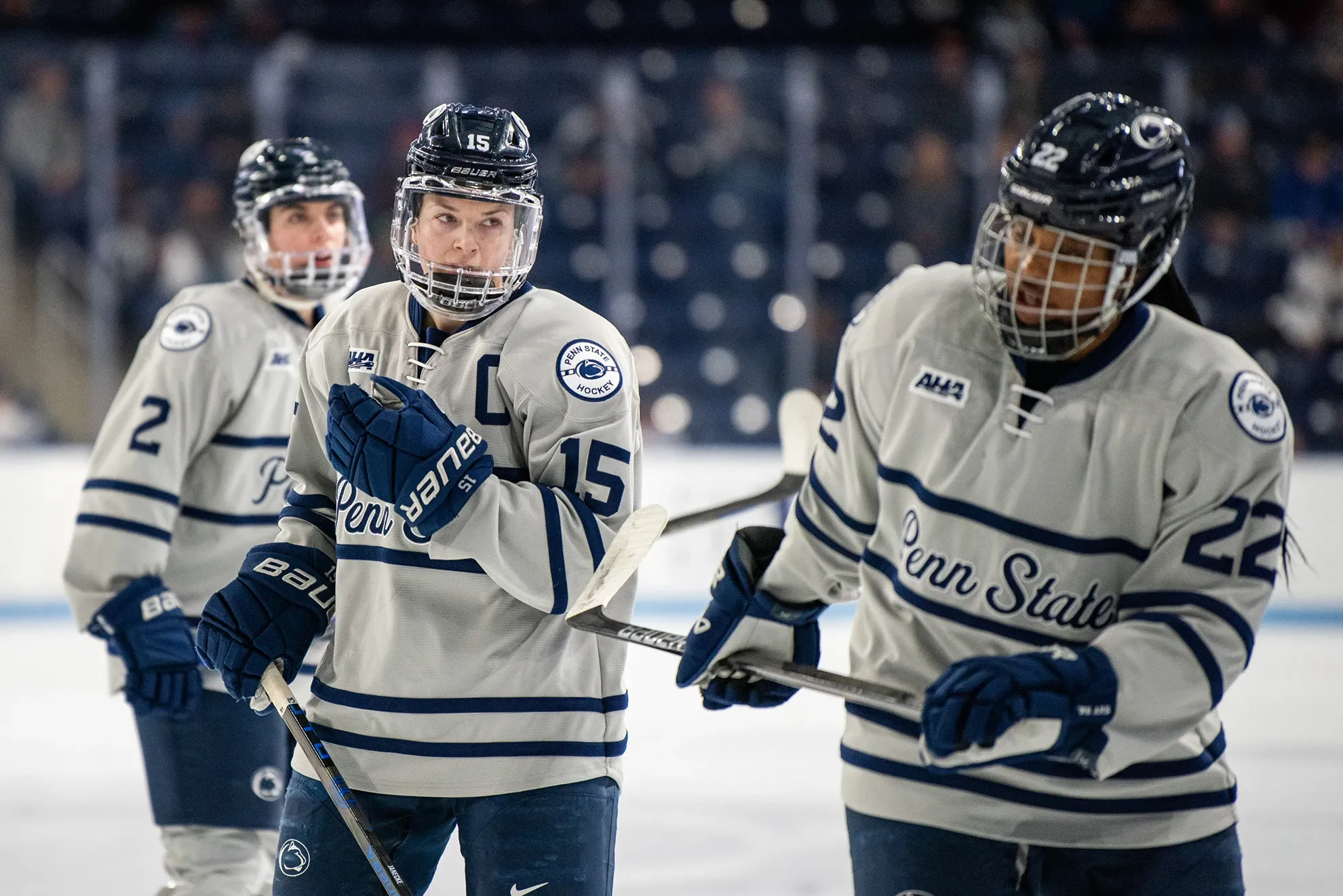
PSU, I’m disappointed in you. There’s nothing technically wrong with the Nittany Lions’ jersey set, they’re just… boring. Their standard home whites have no ornamentation outside of a single, thick navy stripe around the arms and waist. No shoulder yokes, no patches, no nothing interesting. I can appreciate purposeful simplicity in jersey design, but when hockey is played on a white sheet of ice and your white jerseys are so drab, it really gives you nothing visually interesting to focus on. The one thing I’ll give them props for is the Penn State logo, which is a great college sports logo and looks nice on the front of a jersey. Similarly, PSU gets points for having a grey alternate jersey, but the actual design of said jersey is equally dull. They reject the Nittany Lion in favor of an athletic script “Penn State” in between two thin navy stripes, which are also mirrored on the waist and sleeves. If it was a real chest stripe jersey, rather than a fake one with grey space between the thin lines and under the text, I think I would like it more. At least Penn State has the conference championship as a consolation prize.
ECAC
The Best: Union

This was a tough one to decide since the ECAC has so many teams and many of them have solid jersey sets. However, I ultimately gave it to the Garnet Chargers because they have something often lacking from their conference peers: style. Some of this may be simply a side effect of Union’s colors, as the combination of black and maroon makes for a striking look. My favorite of their jerseys is the black alternate, with “Union” in white athletic script across the chest, a maroon shoulder yoke, and two maroon stripes with white piping on the arms and waist. It’s not a style that deviates from classic hockey design, but it has its way of standing out amid its conference peers. Their main maroon jersey is also solid, though I like the Union roundel logo less than the wordmark. I just wish the Garnet Chargers used the very cool athletics U lighting bolt logo on a jersey somewhere.
The Worst: Clarkson
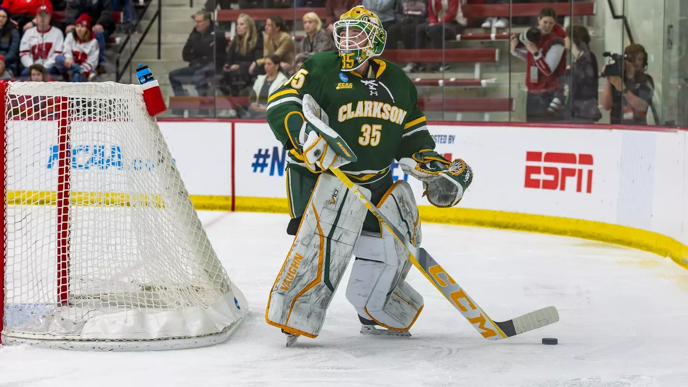
Some of my issues with Clarkson’s jersey set are not unique to the Golden Knights, but I think their execution is particularly poor. First, green and yellow are tough colors to pull off, but they’re also implemented in a way that does the jersey no favors. On both the white and green jerseys, the yellow accent stripes stick out of the design rather than add dimension. The worst offense, though, is the text on the front. ECAC schools have an inexplicable habit of putting numbers on the front of their jerseys and I’m just not a fan of that particular element. You already have numbers on the back, you don’t need to repeat them on the front. However, the Golden Knights also choose to outline their school name and front numbers in yellow. On the white jersey, where the text is in green, the yellow outline just sort of blends into the rest of the jersey, depending on the lighting. With white text on the green jersey, though, it makes the whole thing less legible and muddies the design. I will, however, give Clarkson props for including the cool knight’s head logo as a shoulder patch on the white jerseys.
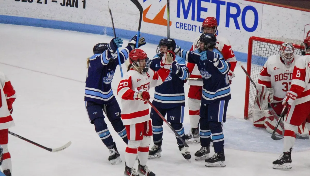
Hockey East
The Best: Maine
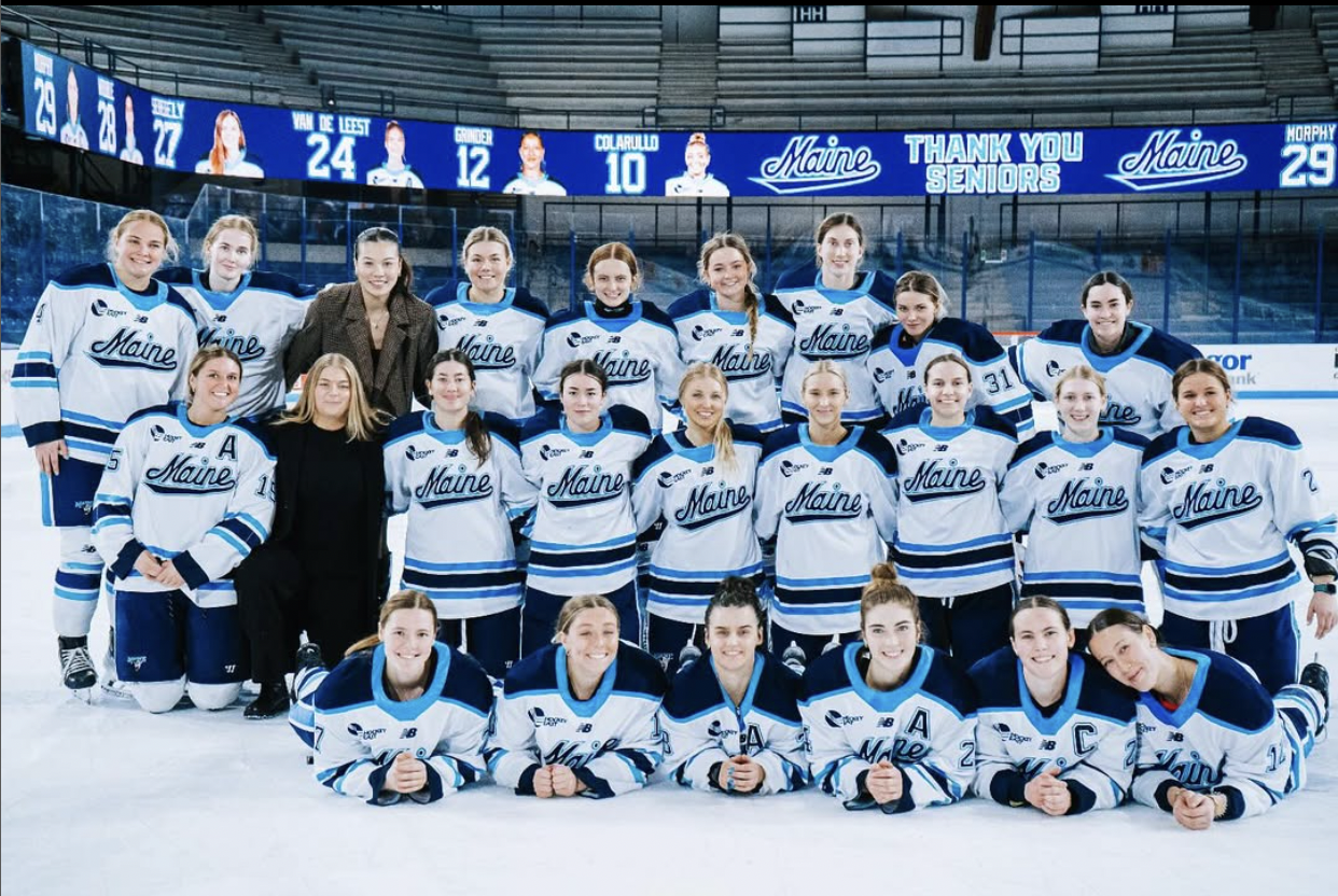
I’m starting to recognize a trend here… I like a good design with an athletic script wordmark and fun or unique colors, and that’s exactly what Maine has. The Black Bears’ shades of blue work wonderfully together, but I’m particularly a fan of the sky blue used for the accent stripes on the white jersey and the thicker stripes and shoulder yoke on the navy jersey. I also appreciate the consistency in the designs, since the home and away uniforms are simply color swaps of each other. My only complaints are that the two outlines on the “Maine” wordmark are perhaps a little excessive, especially on the white jerseys, and the thick collar is a little distracting. Otherwise, bang-up job Black Bears.
The Worst: Providence
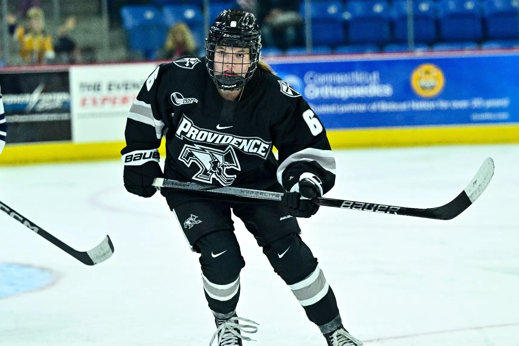
Before I get into the actual elements of Providence’s jersey design, I have to remark on their logo. The polygonal skating Friar is kind of hilarious in a way I can’t quite describe–something about how angular it is, maybe–so I want to give props to the designer responsible for that. Unfortunately, the hockey Friar logo and all its unnecessarily sharp angles are the best part of Providence’s jerseys because everything else is quite boring. Similar to Penn State, black and grey on top of a white sheet of ice offers no visual interest whatsoever. The Friars’ black jerseys are particularly dull, with only white and grey stripes around the arms and shoulder patches for ornamentation. I also dislike that Providence felt the need to put their school name on the front as well as the angular skating Friar. Both logo and name is a bit overkill, so stick to one or the other (I’m looking at you too, Northeastern).
NEWHA
The Best: LIU
Despite being the newest D1 women’s hockey conference, NEWHA has a remarkably strong jersey showing, with a lot of interesting color schemes and logos (does NEWHA have the most purple of any conference? Either way, I love it). The best, however, is hands-down LIU. With colors as bold as sky blue and yellow and a mascot as fierce as theirs, the Sharks had to do some work to pull off a cohesive visual identity, and I think they did. The light blue jerseys with the shark logo and white and yellow accent stripes are striking, but not messy, which is impressive (Clarkson, maybe take some notes). The Sharks’ white jerseys are less effective, relying on yellow elements like a shoulder yoke and two stripes around the arms and waist, as well as a diagonal wordmark. It kind of works regionally, since LIU is in the New York City metro area and the diagonal text is most associated with the New York Rangers, but if you read my PWHL Year 1 jersey reviews, you’ll know I’m not a huge fan of this style. Plus, the blue text with the yellow outline lacks the same punch as the actual shark logo. Still, I’m impressed with LIU’s commitment to the bit and ability to pull it off.
The Worst: Saint Anselm
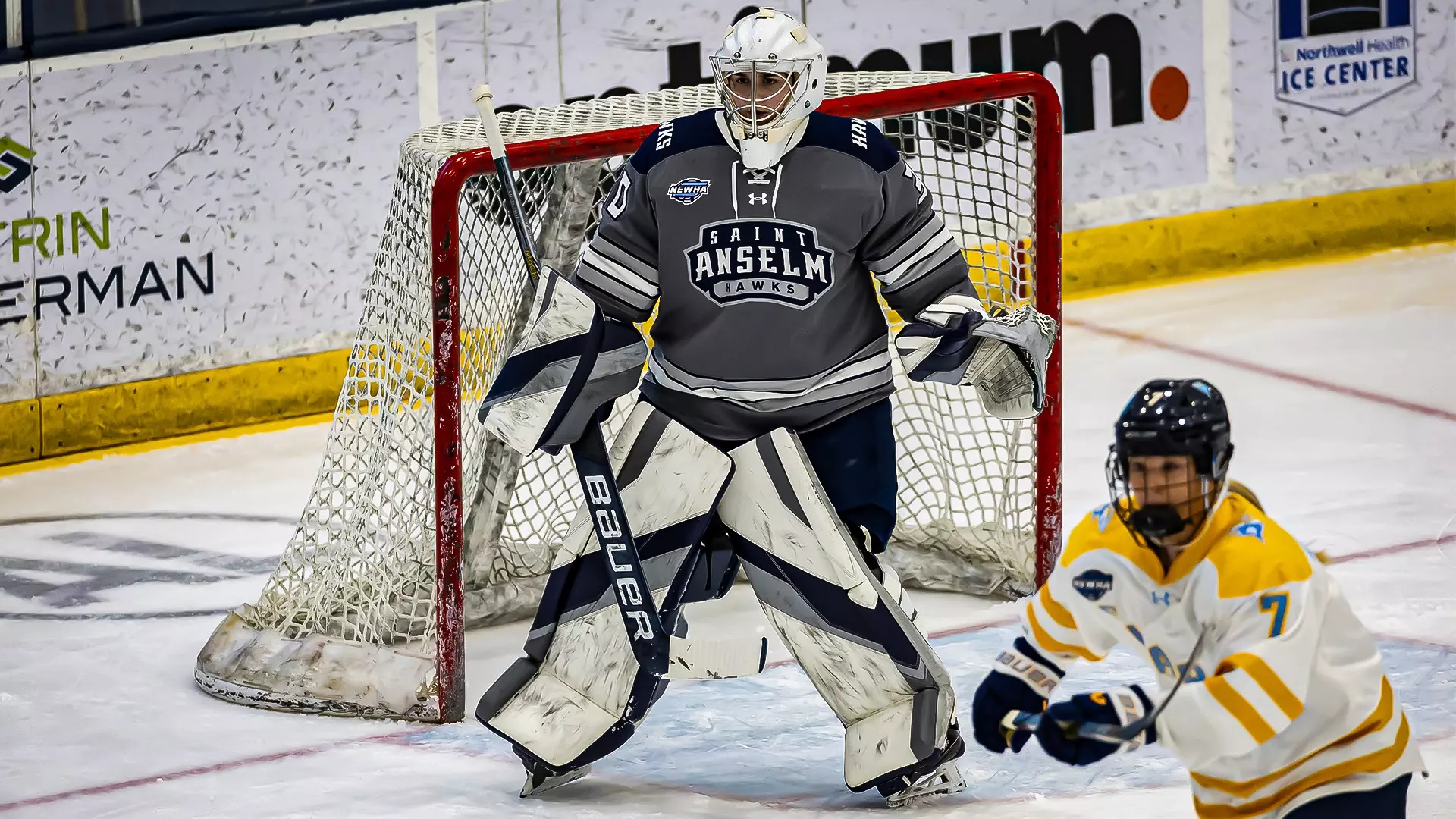
I feel a little bad putting Saint Anselm at the bottom of the jersey pile in the NEWHA because I don’t mind their white jerseys. Sure, they went with the diagonal wordmark, but the rest of the design is simplistically effective. Ultimately, the Hawks ended up here because of their grey jerseys. The combination of grey, white, and navy blue is so dully desaturated, especially when you have to put Saint Anselm against LIU. The worst offense, though, is the logo. The crest-like Saint Anselm athletics logo does not belong front and center on a jersey. It’s too wordy, and it’s weirdly disproportionate because each line of text has a different spacing. I do not like it, plain and simple. The “HAWKS” wordmark on the shoulder yoke is also weirdly placed and doesn’t really add anything to the design. If Saint Anselm had done a nicely arced wordmark with either their school name or mascot and got rid of the shoulder wordmark, maybe the grey jerseys would have been passable, but unfortunately, that’s not the case.
WCHA
The Best: Minnesota State
Ice hockey needs more purple basically always, so thank you Minnesota State for really leaning into it. Their jerseys take full advantage of a great purple and yellow complimentary color scheme through classic, no-frills hockey design. I like the Mavericks’ home jerseys, with the bull head logo front and center and the purple and yellow perfectly balanced on top of a white base, the best. I can also appreciate the “all purple, all the time” energy of the wordmark jerseys, as well as the fact that said wordmark fits nicely within the jersey torso space thanks to the curved “Minnesota” on top of the flat “State.” The Mavericks’ yellow jerseys are a little aggressive compared to their other looks, and they’re also less purple, so therefore less successful. The moral of the story is that more purple is good, and I’m glad the state of Minnesota gets it (see also: St. Thomas and the Minnesota Frost).
The Worst: Bemidji State
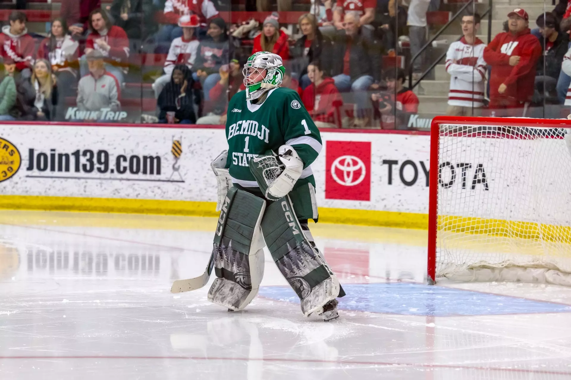
Similar to some other entries that landed at the bottom of their conferences, Bemidji State falls into the “disappointingly boring” category. I actually like their smiling beaver logo, and I think it would totally work as a main crest a la Penn State. However, the Beavers decide to stick with wordmarks for the focal points of their jerseys. On one of their white uniforms, it’s an athletic script “Beavers.” Okay, fine, I do like a good athletic script. But on their green set and its color-swapped partner, it’s just the name of their school in a block serif surrounding the dreaded front numbers. Not only that, the Bemidji State jerseys have nearly nothing else going on except for the wordmarks. The Beavers appear to use the same template as Penn State, with only one thick stripe around each arm and the waist. The white jerseys do have a green shoulder yoke to add a little more balance, but it’s still incredibly dull. If Bemidji State redesigns its uniforms, I want to see the Beaver logo, and I’d like to see a cool striping pattern to take advantage of the fact that green and white are a great color combo.


Comments ()