
TIG Roundtable: PWHL Name and Logo Reveal
Gather 'round, it's time for another TIG roundtable!
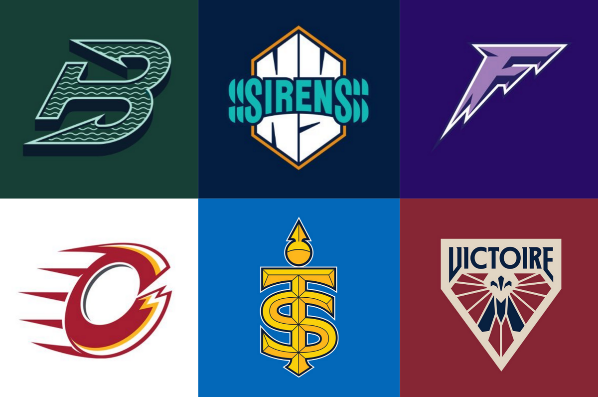
At long last, the PWHL unveiled nicknames and logos for their six franchises on September 9. Logos and merchandise for the Boston Fleet, Minnesota Frost, Montréal Victoire, New York Sirens, Ottawa Charge, and Toronto Sceptres dropped simultaneously with the names, with jerseys coming closer to the start of the season. While we wait for them, many of us here at TIG dusted off our super fancy, very real roundtable and shared our thoughts on the new branding.
Q: What are your general thoughts on the names?
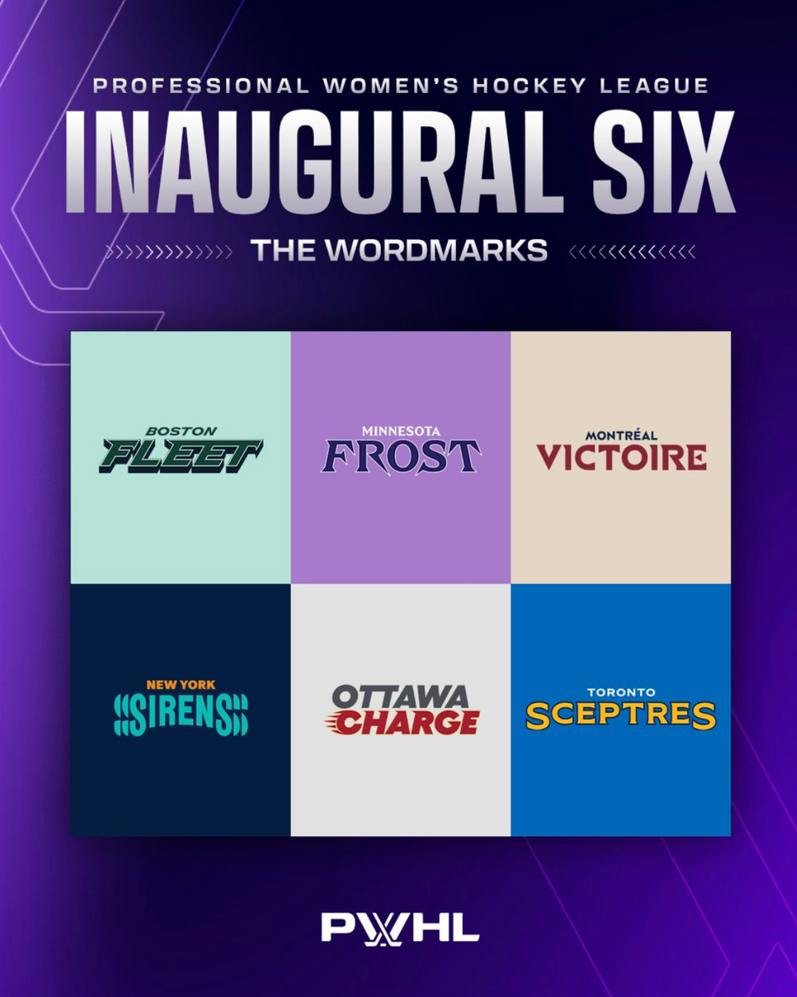
Lydia Murray: As a whole, I think the names are good. Some aren’t particularly exciting, but they’re all connected enough to the city/state they are representing that they work. Everything the PWHL has done has been on a compressed timeline which is not easy, so overall I’m impressed they were able to come up with six solid-to-great names and brands barely a year from the league’s inception.
J Gray: Maybe I was primed by last year’s leak, but I am generally okay with the names. I think they could be better– look at last year’s branding reveals for the seven founding teams in the Pro Volleyball Federation– but, as we have seen, they could also be much worse.
Maya Smith: Overall, I’m really pleased with the name choices. As others have mentioned, the leaks last year tempered my expectations and I was pleasantly surprised with these names. I think they are unique and definitely stand out.
Alyssa Turner: I’ll be honest, I think the names are okay. I’m aware they could’ve been way worse. Like, way worse. But, a majority of the names I felt were fairly lackluster. The rollout, the explanations, and the logos helped me with coming around on most of the names, but from just a name perspective most of them didn’t entirely move me.
LJ Bachenheimer: My thoughts on the team names are a resounding shrug. I don’t hate them and I agree with everyone that they absolutely could have been worse, but I can’t say I’m impressed. It feels like there were some missed opportunities to do something really striking and iconic. Also, I’m really getting tired of this trend of naming sports teams after singular ephemeral nouns.
Q: What are your general thoughts on the logos?
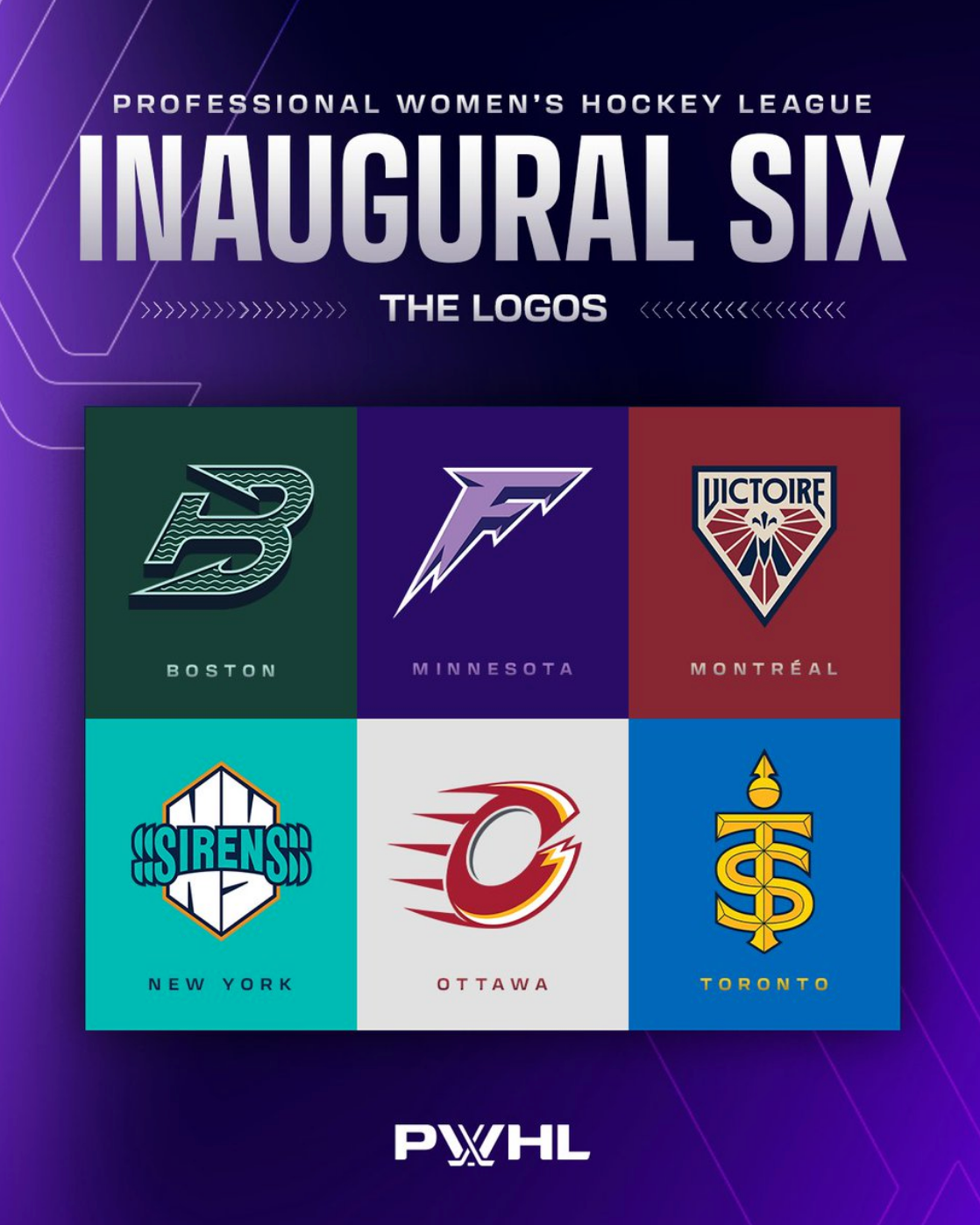
Lydia Murray: I have more mixed feelings on the logos than the names. They’re all at least fine, but I don’t love that some of the letter logos represent the city name and others represent the nickname. Most sports teams that have letter logos represent the city name, so it’s a little funky that the PWHL chose to do a mixed bag, especially since all the brands were created by the same group. However, this might just be a me problem, and I have no complaints about all of the non-lettered logos.
J Gray: It's a mixed bag. To me at least, the effort to connect each team's visual identity to their locale is clear: adding the royal blue for Montréal, New York's block letters that hearken to the Giants without copying, Boston's rather strong resemblance to the Hartford Whalers logo. However, the designs themselves may have been limited by overthinking the names/identities.
Maya Smith: I am less enthusiastic about the logos, but I don’t think we can 100% judge yet. I think seeing them on jerseys will really solidify my feelings about them. As the teams continue to use them on socials and in the season, I think I’ll feel better about them.
Alyssa Turner: I’m trying to picture these logos on jerseys, which is honestly a bit difficult considering we don’t have jerseys. But overall I like them. Some of them I like more than others. Once we get jerseys and see logos on more promotional content and online graphics, I think I’m going to learn to love them more and more.
LJ Bachenheimer: I’ve got split thoughts on the logos. There are some I really like, and some I really don’t. In particular, I’m not a fan of the letter logos. When they were first released, I thought they looked vaguely AI-generated, or at least incredibly corporate in style. I understand the compressed timeline that the league and its designers were on, but I continue to be struck by a feeling of missed opportunity. Perhaps they’ll grow on me more once I see them regularly on jerseys and social media and the like.
Q: Which is your favorite name? Least favorite?
L'esprit de la victoire
— Victoire de Montréal (@PWHL_Montreal) September 9, 2024
The spirit of victory
📰 FR https://t.co/4ryCFtAcCS
📰 EN https://t.co/joTiKcdG5t pic.twitter.com/2tosgQO4ZF
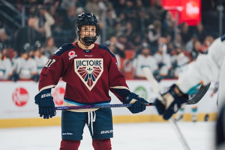
Lydia Murray: My favorite name is the Victoire. I love that they chose not to do an English translation for it, and considering the storied championship history of Montréal, I think it represents the city well.
For the love of the ice. ❄️
— Minnesota Frost (@PWHL_Minnesota) September 9, 2024
📰 https://t.co/kmnO7glUU2 pic.twitter.com/REEwqq9Lul
As for the least favorite, I’m not a huge fan of the Frost. It’s grown on me a little since the announcement, but compared to the other names, it just feels bland. Sure, it represents Minnesota in the sense that Minnesota is cold, but so is Canada and the rest of the northern United States. So, while it works, I wish they’d gone for something more unique to Minnesota.
Toughest together. ⚓️
— Boston Fleet (@PWHL_Boston) September 9, 2024
📰https://t.co/j6GkAAOwoP pic.twitter.com/qWXiZ5a8Iz
J Gray: My favorite name is the Fleet, with an asterisk. If the New York Sirens ever lean into the vicious sea creatures element, rather than ‘the hum of the city,’ that would make that name a lot more meaningful and impactful to me. My least favorite name is the Sceptres. There are a lot of gender-neutral ‘royal’ options. A scepter would have made an amazing logo for the Toronto Royals, Toronto Monarchs, or– sleeper pick– Toronto Empire HC.
We are the Toronto Sceptres. pic.twitter.com/Kytgvby8MX
— Toronto Sceptres (@PWHL_Toronto) September 9, 2024
Maya Smith: My favourite name is Victoire de Montréal. It is so elegant and really just gives me the feeling that I get when I watch PWHL hockey. I also love the idea of keeping it French, even though I think it made some Anglophone Quebecers upset. With the Alouettes and Canadiens having French-only names, it only made sense to make this name Francophone as well. It also makes it so much easier to keep the brand clean across social media. My least favourite is the Sceptres. I don’t really like plural names and it just seems less powerful than the other names. I think there were some really good other royalty-themed names that are more impactful.
Advance - Ottawa – En Avant!
— Ottawa Charge (@PWHL_Ottawa) September 9, 2024
📰 https://t.co/tpSGtmHK4a pic.twitter.com/VE6o1V0kqr
Alyssa Turner: I know I’m in the heavy minority here when I say this but my favourite name is the Ottawa Charge. When I think of Ottawa in season one, I think of the energy in their home rink. From game one to the end of the season, TD Place was an absolute VIBE. I also feel like the city of Ottawa is very lively, the team itself plays with some extra pep in their step, and I just think it works so damn well for the team.
You will always hear us coming.
— New York Sirens (@PWHL_NewYork) September 9, 2024
📰 https://t.co/SQqL9uDzK5 pic.twitter.com/AZtfsudBKi
LJ Bachenheimer: My favorite name is the New York Sirens. I really like the way it flows, it just feels like a cool name for a women’s sports team. I know the team branding is banking on wee-oo-wee-oo rather than mermaids and mythology, but the latter is still where the average person’s mind goes upon hearing the name, and I think the double meaning works in its favor. My least favorite is the Toronto Sceptres. For one, the spelling of the actual name is going to get so confused between Canadians and Americans like myself who want to default to 'Scepters.' For two, I think this is the most mid 'royalty' name they could have picked. When the promos were released, I was so excited for Toronto Monarchs or Toronto Royals or Toronto Reign. Sceptres just feels like a let-down in comparison… but at least they’re not the “Toronto Queens.”
Q: Which is your favorite logo? Least favorite?
— Victoire de Montréal (@PWHL_Montreal) September 9, 2024
Lydia Murray: The Victoire logo is easily my favorite. It matches the power of the name perfectly, and I love the addition of dark blue to their color scheme. My least favorite is probably the Charge logo for a few reasons. For starters, I’m honestly not sure if it’s supposed to be an odd slightly open “O” or a too-closed-off “C.” If it’s the latter, my gripe about logos representing nicknames instead of city names comes into play. However, even if it’s supposed to be an “O,” it looks an awful lot like the NHL’s Calgary Flames logo which is why I think most are seeing a “C” first. Plus, I think there’s more they could’ve done to represent electricity better. That said, I don’t hate it and it will probably grow on me some, but there is definitely room for improvement.
Icicles in motion. ❄️ pic.twitter.com/48JAfK0NmM
— Minnesota Frost (@PWHL_Minnesota) September 9, 2024
J Gray: The Victoire logo is my favorite, 10/10, no notes. My least favorite is the Minnesota Frost logo. The colors are nice and the icicle concept is fine, but it’s really just the letter F. It’s not especially interesting or meaningful beyond that. It doesn’t have to be, but the other logos definitely feel like they tried harder. Furthermore, the Montréal Force also had an F logo, and theirs was cooler.
An electrifying presence on the ice. pic.twitter.com/KSeQjYpr8m
— Ottawa Charge (@PWHL_Ottawa) September 9, 2024
Maya Smith: My favourite is easy, it’s the Victoire. It matches the elegance of the name and brings in Montréal’s fantastic colour scheme so well. My least favourite is the Ottawa Charge. It just doesn’t fit with the other ones, and it looks odd on the white background. As I said earlier, I’m reserving full hatred of it until I see it on the jerseys. For now though, it looks like it was drawn by a child, and the rest were made by a very strong designer.
A closer look at our logo. pic.twitter.com/j8csA57wIm
— Boston Fleet (@PWHL_Boston) September 9, 2024
Alyssa Turner: Okay since everyone picked Montréal, which is technically my favourite but for this roundtable I’m going to convince myself it’s not, so with that said my favourite logo is the Boston Fleet. I’m such a sucker for a deep green. And details within it, the (maybe unintentional) homage to the Whalers, and the boldness of the logo as a whole really makes me love it.
A closer look at our Sceptre. pic.twitter.com/VTNFdua20V
— Toronto Sceptres (@PWHL_Toronto) September 9, 2024
LJ Bachenheimer: I’m with everyone else, the Victoire logo is hands-down the best of the bunch. However, I have to dock it points for including the team name atop the crest. Like I said in my logo reviews, save it for the website; it would look so much better without the wordmark. But I also want to give some props to Toronto. Despite my disdain for the name and the logo’s similarity to a Taylor Swift mark, I think it does look really good. It’s a very obvious logo–it’s a T and an S made to be a scepter–but that’s not a bad thing. The gold atop the blue is striking, the linework is a nice detail, and I like the little scepter bauble and its placement above the interlocked T and S.
Let us break it down for you: pic.twitter.com/EZpICP6iHv
— New York Sirens (@PWHL_NewYork) September 9, 2024
My least favorite is probably a tie between Ottawa and New York, but since everyone’s talked about Ottawa I’ll do New York. As several people have pointed out, it does look like the super S everyone used to draw in their notebooks as a kid and I will never be able to forget that association now. It’s also a busy, text-based logo–so pretty much everything I dislike in logo design. The “NY” is positioned awkwardly behind the “SIRENS” text. The team name itself just doesn’t look right because of bad kerning and the echoing S-es, which are broken up awkwardly. I can’t picture this logo looking right on a jersey, which is a shame.
Q: Are these better than the initial leaks? Were they worth the wait?
As a refresher, the leaked names from before last season were the Boston Wicked, Minnesota Superior, Montréal Echo, New York Sound, Ottawa Alert, and Toronto Torch.
Lydia Murray: All these names are significantly better than the initial leaks. I wasn’t a fan of any of the original trademarked names for many reasons. Some of them weren’t super well connected to their cities, and many would have had issues with things like SEO and recognition as only a sports team and not something else well-known from the community. So, I think they were worth the wait. The league took its time to get it right and while there are still some mixed feelings about the names, there’s little denying they’re unique to the league. Plus, it seems most fans are ready to embrace them, which is the most important part.
J Gray: These names are better than the initial leaks. As for whether they were worth it? That will depend on whether they are embraced by the fans. The PWHL’s Vice President of Brand and Marketing, Kanan Bhatt-Shah, mentioned at the reveal press conference on September 9th that one aspect of the design team’s work was to create things that fans could “imbue with meaning.” I agree with that. The team names will mean as much as the fans put into them.
Maya Smith: I said this on my podcast, but I definitely think they were worth the wait. I think it shows that the league listened to the fans and realized they needed to put more effort into this. I do think it’s clear from these names that the nine-month time frame they had was well used. I would have still liked to see the Ottawa Alert because I like the historical significance there. The rest were not good.
Alyssa Turner: Absolutely a million times better. I’m glad they waited and they didn’t rush. Because what in the world is a Toronto Torch?! There was one name I wish they kept and that was the Ottawa Alert for the historical significance of the original Ottawa Alerts team, but I do understand why they didn’t go with any of the six leaked names.
LJ Bachenheimer: 100% better than the leaks. I had friends who were threatening to abandon their team or the league as a whole if “Boston Wicked” was actually a team name. I agree with Maya and Alyssa that Ottawa Alert would have been okay to keep,;it was my favorite of the leaked bunch because of historical significance and flow. I actually may have liked it better than Ottawa Charge, especially if the logo was good. I’m glad that we got this set of names and identities rather than the leaked ones, but I don’t know if they were fully worth the wait. If expectations were made clear that names and logos were still in progress at the start of the league or during Year 1, I wonder if having more time to craft identities would have benefited the teams of the PWHL.
Comments ()