
Look Like The Pros: Top Picks from the PWHL Team Branded Merch Drop
We scoured the PWHL merch drop to bring you the best of the best.
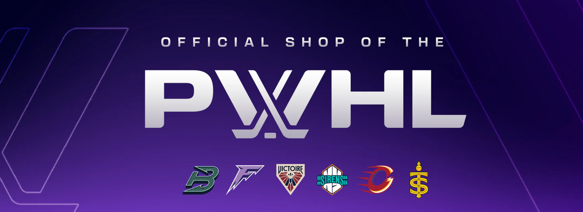
The PWHL announced new names and logos for all six teams on Sept. 11, and at the same time released new merchandise with the new branding. The new lines come through partnerships with Bauer, Royal, Line Change, Peace Collective, and Stadium Essentials. Each team has an assortment of t-shirts, hoodies, sweaters, and hats, and Peace Collective also made two pieces that feature the league's logo and the logos of all six teams.
The difficulty with this first drop is that most of the brands didn't seem to have access to the names of the teams for long before the official announcement. I expect that they had to make their designs ahead of time and tailor them to the team names and colors quickly. What we see is that the merch is fairly standard across the teams, but each team has its own color palette and logo that fit better with certain designs and bases than others. This means there are a few pieces that do a good job of capturing unique design or identity elements despite the general conformity.
Boston Fleet
Design-wise, the Fleet has a strong logo and wordmark, while the current color palette is somewhat weak. However, mint green, evergreen, and dark gray go pretty well with white, black, and two-tone gray, which are the base colors for most of the pieces in the collection. That means that while fewer pieces really jump out, the average is pretty solid.
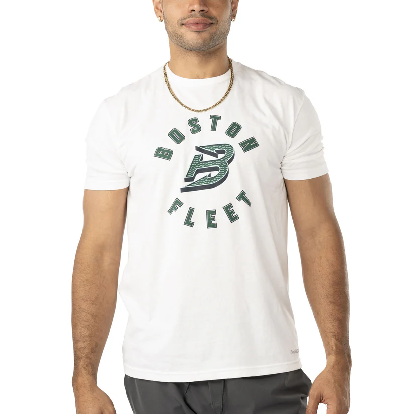
Bauer's Circle Logo T-shirt prominently displays the Fleet logo and name on a white background. This allows the logo to retain depth with gray shadow and mint green accents while maintaining readability and brand identity.
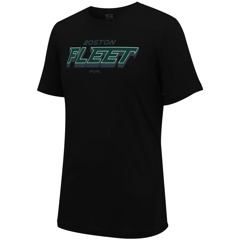
The Wordmark T-shirt loses some of that readability as it is only available on a black background, but the appeal comes from the clear presentation of the sleek and expressive wordmark, one of Boston’s strong visual elements. Note that this wordmark has only one highlight color, a mint green, and gray shadow, in contrast with the mint and white outlines seen on Bauer’s Front Logo Back Name T-shirt that has the wordmark on the back. This choice gives the Stadium Essentials piece a more minimalist vibe that feels very cool.
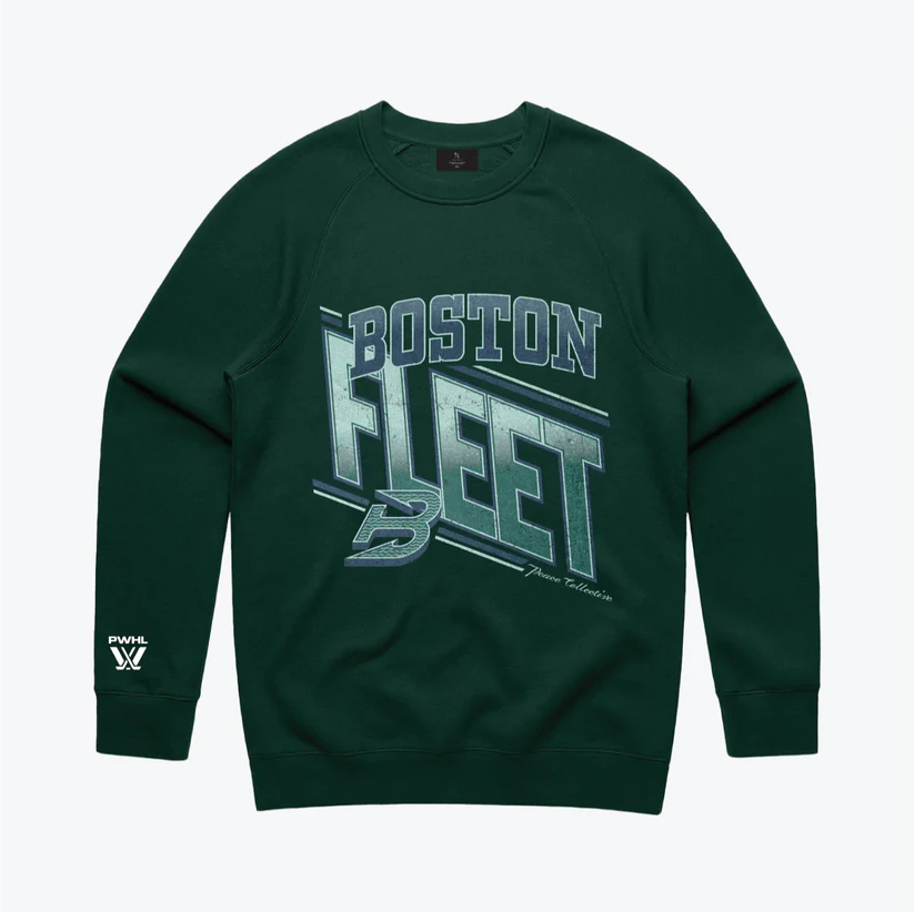
Crew neck sweaters are Massachusetts fashion whether you’re repping your alma mater or your favorite hockey team. Although the Fleet’s evergreen may not feel very ‘Boston hockey,’ it does feel very Massachusetts, and that’s what makes this piece stand out. However, this item is sold out (available to pre-order) in every size.
Minnesota Frost
Similar to the Fleet, Minnesota’s focal point is their bold logo, while their color palette is a little weaker. The primary color in their logo is lilac, with last year’s prominent darker purple acting as an accent along with ‘blizzarding white.’ The limitations in the color scheme mean that other design elements have to carry more weight to make team merchandise engaging.
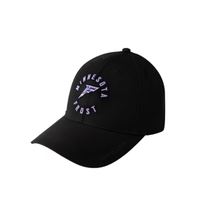
The Bauer Performance Logo Hat design falls flat for me in some of the other teams’ collections because the limited space means unique design elements don’t have the same impact. However, shrinking the Frost logo for this design still works because the most important visual elements—the spikiness of the F and the three colors—can be easily preserved, with the black background ensuring visibility.
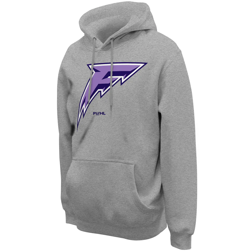
The textured background to the Stadium Essentials Logo Hoodie lends a vividness to the smoothness of the Frost logo, allowing it to pop off the chest more than it does on some of the single-tone pieces. The gray base also allows for a double outline of the logo in white and the darker purple shade, which makes it feel more crisp and complete than it does on black bases.
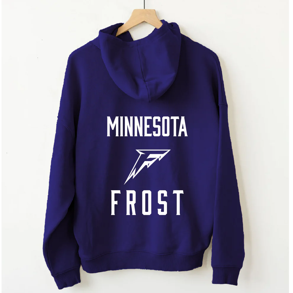
Where the Stadium Essentials hoodie enhanced the Frost logo by adding visual elements, the Line Change Back Hit Hockey Hoodie added by subtraction. With only two colors used in the design, the Frost logo has been flattened in a way that enhances the icicle motif.
Victoire de Montréal
With the most visually complex logo and the most balanced color palette in the league, the Victoire has a leg up on the other teams visually. All a basic merchandise design has to do is give the existing elements their place to shine. There are some downsides to being internally complete, though. The Victoire's palette suffers when applied to the white, black, and gray bases of this round of merchandise, with only a few exceptions. Further, only a few designs could fit in the stunning royal blue accent color or their darker navy accent color. And lastly, as most of the lines aren’t utilizing the team wordmarks, the Victoire’s lovely typeface didn’t get a chance to shine.
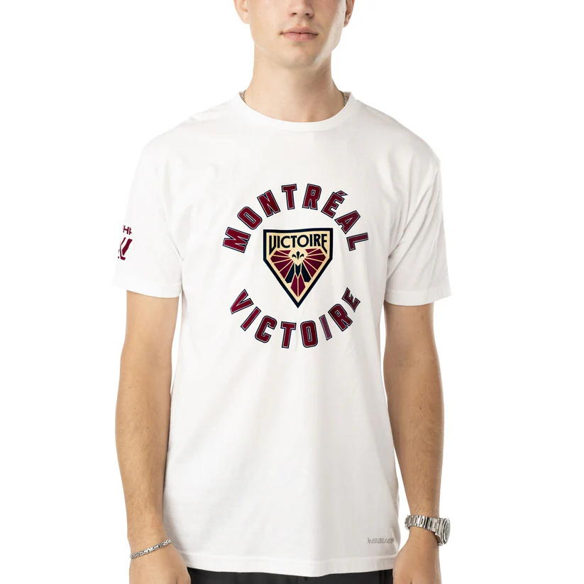
Bauer’s Circle Logo T-shirt once again allowed a team’s logo to show off to best effect. The black outline around the logo makes the cream inside and white without look intentional and increases the contrast for the colors within, making them feel richer as they might on a maroon background. It loses something spiritually for lack of the dark navy blue that has been used by the team elsewhere, but it’s a striking look.
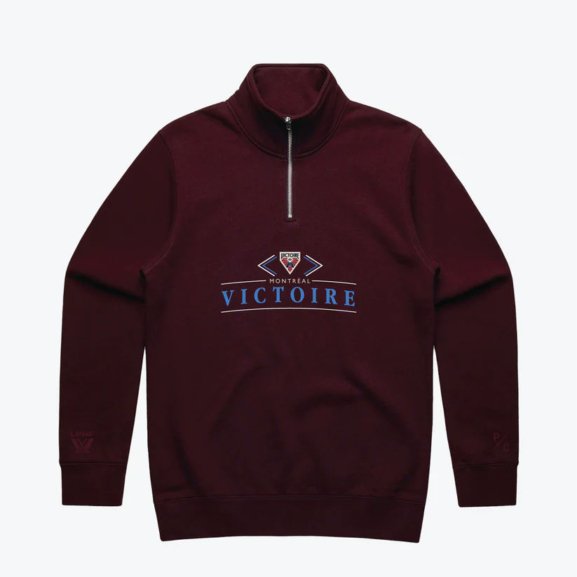
Peace Collective's Fleece Quarter Zip is one of only two pieces in this merch drop to utilize this brilliant, almost azure shade, and it does it to great effect. It grabs your attention even on the retail image, but check out the Peace Collective Instagram post to see how it looks in daylight and on the street. However, this item is sold out (available to pre-order) in Medium and Large.
New York Sirens
The New York Sirens are joining a strong and storied sports market. There is a rich visual history to draw on which undoubtedly influenced their branding elements. This makes it fairly easy for items in even this early merch drop to make meaningful cultural references, despite the apparent desire to avoid the obvious sirens of mythology connection.
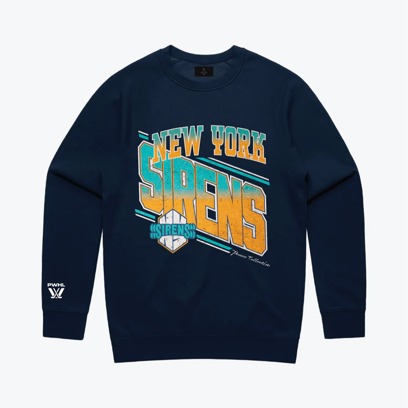
The only piece in the Siren’s offerings to feature the newly introduced orange color as more than a ‘goal horn halo’ accent outline, the Peace Collective Vintage Fleece Crew immediately feels familiar. Many teams in the New York area have used some combination of orange and blue, so this design fits in with the native scheme while still feeling fresh and new. However, this item is sold out (available to pre-order) in every size.
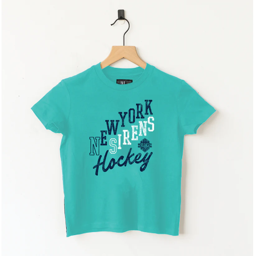
This Line Change youth-exclusive line has the same design for each team, but it’s the Sirens t-shirt that really feels like something a local would buy to outfit their young daughter for the game. New York’s cool turquoise is the most kid-friendly base color of the bunch and it goes well with the playful ‘Hockey’ script.
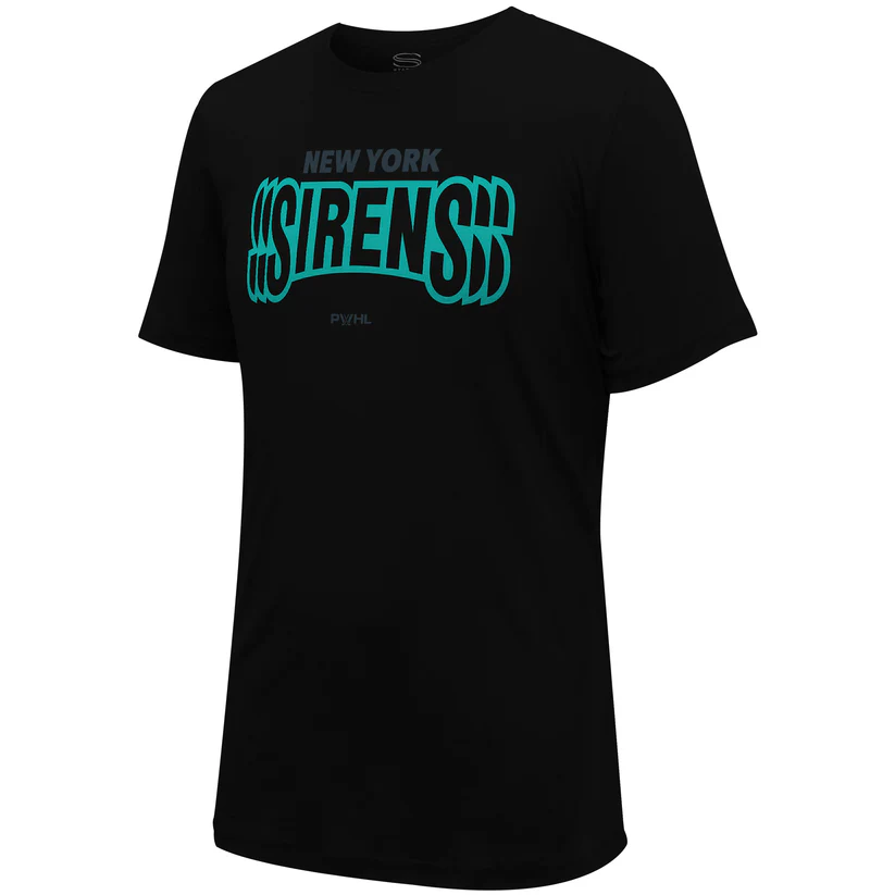
Written in black and outlined in turquoise, the Sirens’ inverted-color logo looks very cool on the black base of the Stadium Essentials Wordmark T-shirt. Without any of the Siren’s new orange color to set it apart, this is a piece a fan could feel comfortable wearing to cheer on the Sirens, the Liberty, or Gotham FC. Bauer’s Front Logo Back Name T-shirt also carries this version of the logo on the upper back.
Ottawa Charge
The Charge’s color palette and round logo do a great job of matching the visual mold of Ottawa other sports teams, which includes a lot of black, red, and round logos, with some bronze to gold shades thrown in here and there. While this means the Charge will fit in neatly with the profile of the area, it might make it difficult to stand out.
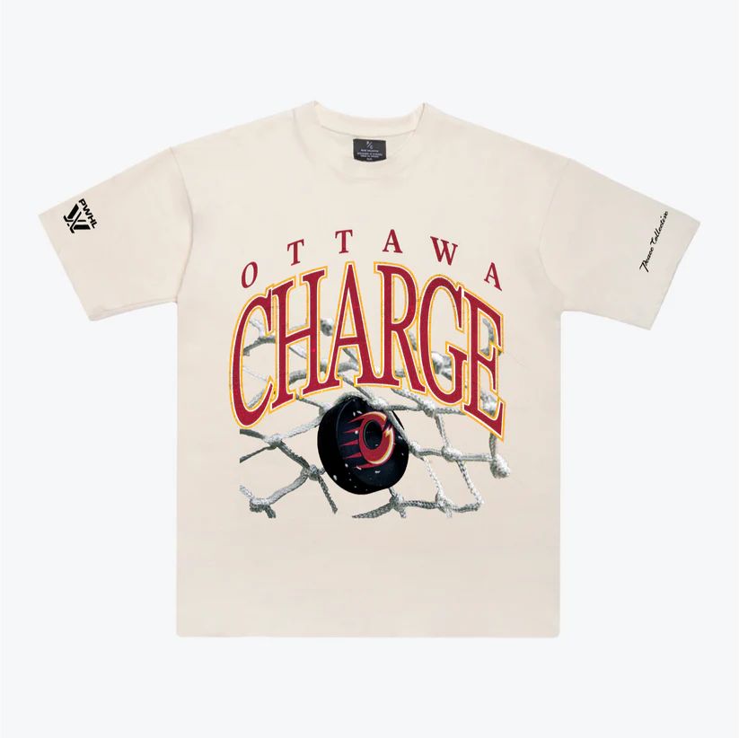
The Peace Collective’s Vintage Heavy Weight T-shirt line comes on a cream base, and out of all the teams, that works best for the Charge. While the brightness of the Charge's gold can get lost on a black or white base, on the cream background the gold takes on an extra warmth and vibrance. Check out Peace Collective’s Instagram post to see it on the street.
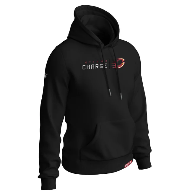
With the same base color and font on the whole line, the Royalty Cloud Hoodies come across a little generic for most of the teams, but it looks cool for Ottawa, probably because black is a natural addition to the Charge's color palette. The white ‘Charge’ lettering helps bring out the brightness of the white and gold in the logo and keeps them from getting lost.
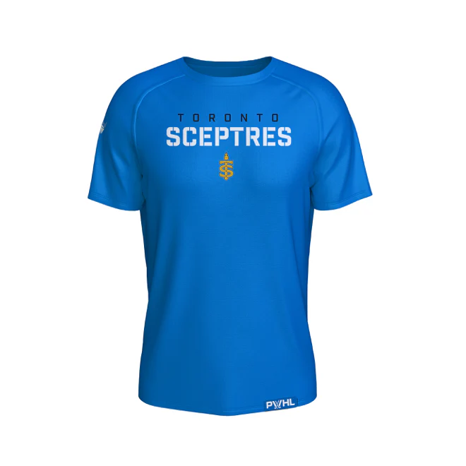
Toronto Sceptres
The Scepters’ new blue and goldenrod pairing is their strongest visual element, and it’s going to look incredible on the ice. Off the ice, we may have to wait a while longer. While the logo is unique and striking, it needs the combination of the rich blue base and the heavily saturated gold to really shine, and that wasn't possible for the most part on the white, black, and gray bases. Toronto’s offerings suffer from this as a whole, but not irredeemably so.
The only item available at the moment that heavily features Toronto’s vivacious blue, the Royalty Elevated T-shirt benefits from having the gold logo on the blue base as intended. The blue and white of the lettering for the name works.
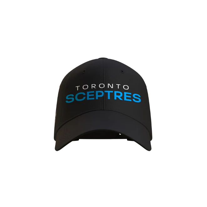
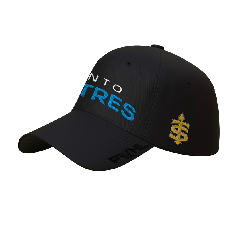
Royalty was also able to nail the colors on their hat. The rich blue gleams off the black base, and the logo on the side also pops. However, this item is currently sold out.
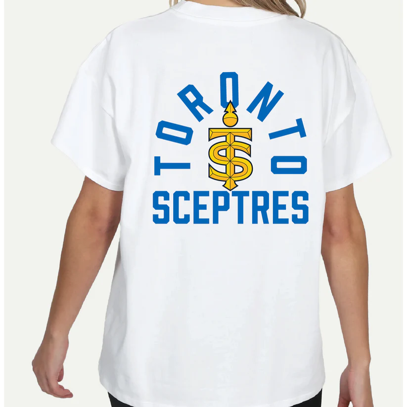
A white base also lets the Sceptres colors blaze for themselves if there’s enough of them. It’s not as brazen a look as it would be with a blue base, but the design is eye-catching and lets the logo speak for itself. Line Change read the assignment and this shirt is clean.
The League
In addition to putting out quarter zips, crew neck sweaters, and t-shirts for each team, Peace Collective designed two PWHL items as well, and I think they look pretty great.
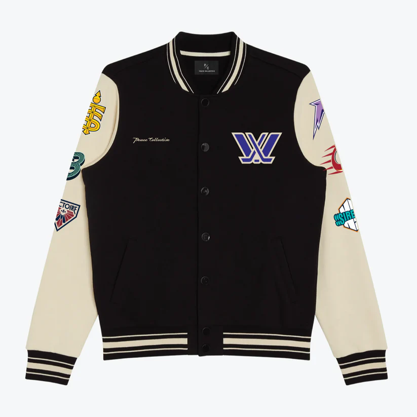
The Letterman Jacket is tight. It’s no wonder this item sold out quickly. The cream base works for almost all of the logos, including the league logo. The motto ‘Own the ice’ also looks very bold and striking on the back. Hopefully they’ll restock soon– the item has a 'Notify Me' tag on it, unique among all the products in this drop.
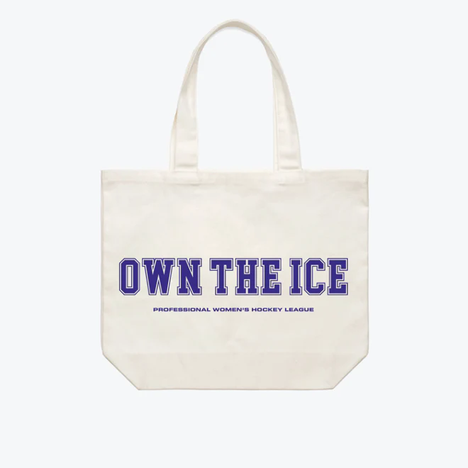
The Tote with the six team logos and ‘Own the ice’ in PWHL purple is also very neat, and also sold out (available to pre-order).


Comments ()